In [1]:
# Set up packages for lecture. Don't worry about understanding this code,
# but make sure to run it if you're following along.
import numpy as np
import babypandas as bpd
import pandas as pd
from matplotlib_inline.backend_inline import set_matplotlib_formats
import matplotlib.pyplot as plt
set_matplotlib_formats("svg")
plt.style.use('ggplot')

plt.rcParams['figure.figsize'] = (10, 5)

np.set_printoptions(threshold=20, precision=2, suppress=True)
pd.set_option("display.max_rows", 7)
pd.set_option("display.max_columns", 8)
pd.set_option("display.precision", 2)

import warnings
warnings.filterwarnings('ignore')

# Demonstration code
from IPython.display import display
import ipywidgets as widgets
import plotly.express as px

def r_scatter(r):
    "Generate a scatter plot with a correlation approximately r"
    x = np.random.normal(0, 1, 1000)
    z = np.random.normal(0, 1, 1000)
    y = r * x + (np.sqrt(1 - r ** 2)) * z
    plt.scatter(x, y)
    plt.xlim(-4, 4)
    plt.ylim(-4, 4)
    plt.title(f'$r={r}$')
    
def show_scatter_grid():
    plt.subplots(1, 4, figsize=(10, 2))
    for i, r in enumerate([-1, -2/3, -1/3, 0]):
        plt.subplot(1, 4, i+1)
        r_scatter(r)
        plt.title(f'r = {np.round(r, 2)}')
    plt.show()
    plt.subplots(1, 4, figsize=(10, 2))
    for i, r in enumerate([1, 2/3, 1/3]):
        plt.subplot(1, 4, i+1)
        r_scatter(r)
        plt.title(f'$r = {np.round(r, 2)}$')
    plt.subplot(1, 4, 4)
    plt.axis('off')
    plt.show()

Lecture 24 – Correlation

DSC 10, Fall 2023

Announcements

  • Quiz 4 is today in discussion section.
    • It covers Lectures 18 through 22.
    • Prepare by solving relevant problems on practice.dsc10.com.
  • Homework 6 is due Friday at 11:59PM.
  • The Final Project is due Tuesday 12/5 at 11:59PM.

Agenda

  • Recap: Statistical inference.
  • Association.
  • Correlation.
  • Regression.

Recap: Statistical inference

What we've learned about inference

At a high level, the second half of this class has been about statistical inference – using a sample to draw conclusions about the population.

  • To test whether a sample came from a known population distribution, use "standard" hypothesis testing.
  • To test whether two samples came from the same unknown population distribution, use permutation testing.
  • To estimate a population parameter given a single sample, construct a confidence interval using bootstrapping (for most statistics) or the CLT (for the sample mean).
  • To test whether a population parameter is equal to a particular value, $x$, construct a confidence interval using bootstrapping (for most statistics) or the CLT (for the sample mean), and check whether $x$ is in the interval.

Moving forward

  • For the remainder of the quarter, we'll switch our focus to prediction – given a sample, what can I predict about data not in that sample?
  • Specifically, we'll focus on linear regression, a prediction technique that tries to find the best "linear relationship" between two numerical variables.
  • Along the way, we'll address another idea – correlation.
  • You will see linear regression in many more courses – it is one of the most important tools in the data science toolkit.

Association

Prediction

  • Suppose we have a dataset with at least two numerical variables.
  • We're interested in predicting one variable based on another:
    • Given my education level, what is my income?
    • Given my height, how tall will my kid be as an adult?
    • Given my age, how many countries have I visited?
  • To do this effectively, we need to first observe a pattern between the two numerical variables.
  • To see if a pattern exists, we'll need to draw a scatter plot.

Association

  • An association is any relationship or link 🔗 between two variables in a scatter plot. Associations can be linear or non-linear.
  • If two variables have a positive association ↗️, then as one variable increases, the other tends to increase.
  • If two variables have a negative association ↘️, then as one variable increases, the other tends to decrease.
  • If two variables are associated, then we can predict the value of one variable based on the value of the other.

Example: Hybrid cars 🚗

Our dataset, taken from here, contains information about several hybrid cars with model years from 1997 through 2013.

In [2]:
hybrid = bpd.read_csv('data/hybrid.csv')
hybrid
Out[2]:
vehicle year price acceleration mpg class
0 Prius (1st Gen) 1997 24509.74 7.46 41.26 Compact
1 Tino 2000 35354.97 8.20 54.10 Compact
2 Prius (2nd Gen) 2000 26832.25 7.97 45.23 Compact
... ... ... ... ... ... ...
150 C-Max Energi Plug-in 2013 32950.00 11.76 43.00 Midsize
151 Fusion Energi Plug-in 2013 38700.00 11.76 43.00 Midsize
152 Chevrolet Volt 2013 39145.00 11.11 37.00 Compact

153 rows × 6 columns

'price' vs. 'acceleration'

Is there an association between these two variables? If so, what kind?

(Note: When looking at a scatter plot, we often describe it in the form "$y$ vs. $x$.")

In [3]:
hybrid.plot(kind='scatter', x='acceleration', y='price');
2023-11-29T01:03:23.242243 image/svg+xml Matplotlib v3.5.2, https://matplotlib.org/

Acceleration here is measured in kilometers per hour per second – this means that larger accelerations correspond to quicker cars!

'price' vs. 'mpg'

Is there an association between these two variables? If so, what kind?

In [4]:
hybrid.plot(kind='scatter', x='mpg', y='price');
2023-11-29T01:03:23.299960 image/svg+xml Matplotlib v3.5.2, https://matplotlib.org/
  • There is a negative association – cars with better fuel economy tended to be cheaper.
    • Why do we think that's the case?
    • Is this always the case today, with the advent of expensive electric cars?
  • The association looks more curved than linear.
    • It may roughly follow $y \approx \frac{1}{x}$.

Exploring the data

Just for fun, we can look at an interactive version of the previous plot. Hover over a point to see the name of the corresponding car.

In [5]:
px.scatter(hybrid.to_df(), x='mpg', y='price', hover_name='vehicle')

Do you recognize any of the most expensive or most efficient cars? (If not, Google "ActiveHybrid 7i", "Panamera S", and "Prius.")

Measuring association

  • We're able to look at a scatter plot and tell, roughly, whether there's an association between two variables and whether it's positive or negative.
  • Our first step when analyzing two numerical variables should always be to draw a scatter plot.
  • With that said, we should also have a way of measuring whether there is an association between two numerical variables quantitatively – that is, using math and code.

Correlation

Definition: Correlation coefficient

  • The correlation coefficient $r$ of two variables $x$ and $y$ measures the strength of the linear association between $x$ and $y$. That is, it measures how clustered points are around a straight line.
  • $r$ is the:
    • average value of the
    • product of $x$ and $y$,
    • when both are measured in standard units.
  • $r$ is always between -1 and 1.
  • Let's look at some examples, before trying to understand where the formula comes from and learning how to interpret $r$.

Example values of $r$

Consider the following few scatter plots.

In [6]:
show_scatter_grid()
2023-11-29T01:03:23.649325 image/svg+xml Matplotlib v3.5.2, https://matplotlib.org/
2023-11-29T01:03:23.941286 image/svg+xml Matplotlib v3.5.2, https://matplotlib.org/

Observation: When $r = 1$, the scatter plot of $x$ and $y$ is a line with a positive slope, and when $r = -1$, the scatter plot of $x$ and $y$ is a line with a negative slope. When $r = 0$, the scatter plot of $x$ and $y$ is a patternless cloud of points.

To see more example scatter plots with different values of $r$, play with the widget that appears below.

In [7]:
widgets.interact(r_scatter, r=(-1, 1, 0.05));
interactive(children=(FloatSlider(value=0.0, description='r', max=1.0, min=-1.0, step=0.05), Output()), _dom_c…

Let's now compute the value of $r$ for the two scatter plots ('price' vs. 'acceleration' and 'price' vs. 'mpg') we saw earlier.

Calculating $r$

  • $r$ is the average value of the product of $x$ and $y$, when both are measured in standard units.
  • Recall: Suppose $x$ is a numerical variable, and $x_i$ is one value of that variable. To convert $x_i$ to standard units, $$x_{i \: \text{(su)}} = \frac{x_i - \text{mean of $x$}}{\text{SD of $x$}}$$
In [8]:
def standard_units(col):
    return (col - col.mean()) / np.std(col)

Let's define a function that calculates the correlation, $r$, between two columns in a DataFrame.

In [9]:
def calculate_r(df, x, y):
    '''Returns the average value of the product of x and y, 
       when both are measured in standard units.'''
    x_su = standard_units(df.get(x))
    y_su = standard_units(df.get(y))
    return (x_su * y_su).mean()

'price' vs. 'acceleration'

Let's calculate $r$ for 'acceleration' and 'price'.

In [10]:
hybrid.plot(kind='scatter', x='acceleration', y='price');
2023-11-29T01:03:24.166295 image/svg+xml Matplotlib v3.5.2, https://matplotlib.org/
In [11]:
calculate_r(hybrid, 'acceleration', 'price')
Out[11]:
0.695577899691398

Observation: $r$ is positive, and the association between 'acceleration' and 'price' is positive.

'price' vs. 'mpg'

Let's now calculate $r$ for 'mpg' and 'price'.

In [12]:
hybrid.plot(kind='scatter', x='mpg', y='price');
2023-11-29T01:03:24.227465 image/svg+xml Matplotlib v3.5.2, https://matplotlib.org/
In [13]:
calculate_r(hybrid, 'mpg', 'price')
Out[13]:
-0.5318263633683789

Observation: $r$ is negative, and the association between 'mpg' and 'price' is negative.

Also, $r$ here is closer to 0 than it was on the previous slide – that is, the magnitude (absolute value) of $r$ is less than in the previous scatter plot – and the points in this scatter plot look less like a straight line than they did in the previous scatter plot.

Linear transformations

  • To understand the role of standard units in the calculation of $r$, we need to discuss linear transformations.
  • A linear transformation to a variable results from adding, subtracting, multiplying, and/or dividing each value by a constant. For example, the conversion from degrees Celsius to degrees Fahrenheit is a linear transformation:

    $$\text{temperature (Fahrenheit)} = \frac{9}{5} \times \text{temperature (Celsius)} + 32$$

  • When you apply a linear transformation to variables in a scatter plot, all you're doing is changing the units they're measured in. This doesn't change the shape of the plot.
  • In other words, instead of plotting price in dollars and fuel economy in miles per gallon, we could plot price in Yen (🇯🇵) and fuel economy in kilometers per gallon and the plot would look the same, just with different axes.
In [14]:
hybrid.plot(kind='scatter', x='mpg', y='price', title='price (dollars) vs. mpg');
2023-11-29T01:03:24.287354 image/svg+xml Matplotlib v3.5.2, https://matplotlib.org/
In [15]:
hybrid.assign(
    price_yen=hybrid.get('price') * 147.20, # The USD to Japanese Yen exchange rate as of today morning.
    kpg=hybrid.get('mpg') * 1.6             # 1 mile is 1.6 kilometers.
).plot(kind='scatter', x='kpg', y='price_yen', title='price (yen) vs. kpg');
2023-11-29T01:03:24.350917 image/svg+xml Matplotlib v3.5.2, https://matplotlib.org/

Why does the formula for $r$ involve standard units?

  • The conversion of a variable to standard units is a linear transformation.
$$x_{i \: \text{(su)}} = \frac{x_i - \text{mean of $x$}}{\text{SD of $x$}}$$
  • Since changing the units doesn't change the shape of the plot, it also doesn't change the strength of the linear association present in the plot – it doesn't change how much the plot resembles a straight line. This means it shouldn't change the value of $r$.
  • By always converting both $x$ and $y$ to standard units when computing $r$, we're converting all variables to a consistent set of units, to ensure that the interpretation of $r$ doesn't depend on the specific units we happened to use.
  • For instance,

    $$r\big(\text{price in dollars}, \text{fuel economy in miles per gallon}\big)$$

    and
    $$r\big(\text{price in Yen}, \text{fuel economy in kilometers per gallon}\big)$$ are the same, because prices and fuel economies are converted to standard units when computing $r$.

Scatter plots in standard units

To better understand why $r$ is the average value of the product of $x$ and $y$, when both are measured in standard units, let's convert the 'acceleration', 'mpg', and 'price' columns to standard units, redraw the same scatter plots we saw earlier, and explore what we can learn from the product of $x$ and $y$ in standard units.

In [16]:
def standardize(df):
    """Return a DataFrame in which all columns of df are converted to standard units."""
    df_su = bpd.DataFrame()
    for column in df.columns:
        # This uses syntax that is out of scope; don't worry about how it works.
        df_su = df_su.assign(**{column + ' (su)': standard_units(df.get(column))})
    return df_su

hybrid_su = standardize(hybrid.get(['acceleration', 'mpg', 'price']))
hybrid_su
Out[16]:
acceleration (su) mpg (su) price (su)
0 -1.54 0.59 -6.94e-01
1 -1.28 1.76 -1.86e-01
2 -1.36 0.95 -5.85e-01
... ... ... ...
150 -0.07 0.75 -2.98e-01
151 -0.07 0.75 -2.90e-02
152 -0.29 0.20 -8.17e-03

153 rows × 3 columns

'price' vs. 'acceleration'

Here, 'acceleration' and 'price' are both measured in standard units. Note that the shape of the scatter plot is the same as before; it's just that the axes are on a different scale.

In [17]:
hybrid_su.plot(kind='scatter', x='acceleration (su)', y='price (su)')
plt.axvline(0, color='black')
plt.axhline(0, color='black');
2023-11-29T01:03:24.421354 image/svg+xml Matplotlib v3.5.2, https://matplotlib.org/
  • The association between 'acceleration' ($x$) and 'price' ($y$) is positive ↗️. Most data points fall in either the lower left quadrant (where $x_{i \: \text{(su)}}$ and $y_{i \: \text{(su)}}$ are both negative) or the upper right quadrant (where $x_{i \: \text{(su)}}$ and $y_{i \: \text{(su)}}$ are both positive).
  • In other words, $x_{i \: \text{(su)}}$ and $y_{i \: \text{(su)}}$ usually have the same sign.
  • On average, $x_{i \: \text{(su)}} \times y_{i \: \text{(su)}}$ should be positive, since when you multiply two numbers with the same sign, the result is positive.
  • As a result, $r$, which is the average of $x_{i \: \text{(su)}} \times y_{i \: \text{(su)}}$, is positive here:
In [18]:
calculate_r(hybrid, 'acceleration', 'price')
Out[18]:
0.695577899691398

'price' vs. 'mpg'

Here, 'mpg' and 'price' are both measured in standard units. Again, note that the shape of the scatter plot is the same as before.

In [19]:
hybrid_su.plot(kind='scatter', x='mpg (su)', y='price (su)')
plt.axvline(0, color='black');
plt.axhline(0, color='black');
2023-11-29T01:03:24.535209 image/svg+xml Matplotlib v3.5.2, https://matplotlib.org/
  • The association between 'mpg' ($x$) and 'price' ($y$) is negative ↘️. Most data points fall in the upper left or lower right quadrants.
  • In other words, $x_{i \: \text{(su)}}$ and $y_{i \: \text{(su)}}$ usually have opposite signs – for most points, one of $x_{i \: \text{(su)}}$ or $y_{i \: \text{(su)}}$ is usually positive, while the other is negative.
  • On average, $x_{i \: \text{(su)}} \times y_{i \: \text{(su)}}$ should be negative, since when you multiply two numbers with opposite signs ($\text{positive number} \times \text{negative number}$) the result is negative.
  • As a result, $r$, which is the average of $x_{i \: \text{(su)}} \times y_{i \: \text{(su)}}$, is negative here:
In [20]:
calculate_r(hybrid, 'mpg', 'price')
Out[20]:
-0.5318263633683789

Interpreting $r$

  • As mentioned before, the correlation coefficient $r$ of two variables $x$ and $y$ measures the strength of the linear association between $x$ and $y$. That is, it measures how clustered points are around a straight line.
  • Terminology: If two variables are correlated, it means they are linearly associated.
  • $r$ is always between $-1$ and $1$.
    • If $r = 1$, the scatter plot of $x$ and $y$ is a line with a positive slope.
    • If $r = -1$, the scatter plot of $x$ and $y$ is a line with a negative slope.
    • If $r = 0$, there is no linear association between $x$ and $y$ (they are uncorrelated).
In [21]:
# Once again, run this cell and play with the slider that appears!
widgets.interact(r_scatter, r=(-1, 1, 0.05));
interactive(children=(FloatSlider(value=0.0, description='r', max=1.0, min=-1.0, step=0.05), Output()), _dom_c…
  • $r$ is computed based on standard units, and is symmetric.
    • The correlation between price in dollars and fuel economy in miles per gallon is the same as the correlation between price in Yen and fuel economy in kilometers per gallon.
    • The correlation between price and fuel economy is the same as the correlation between fuel economy and price, because $x \times y = y \times x$.
  • $r$ quantifies how well we can predict one variable using the other.
    • If $r$ is close to $1$ or $-1$ we can predict one variable from the other quite accurately.
    • If $r$ is close to $0$, we cannot make good predictions.

Concept Check ✅ – Answer at cc.dsc10.com

Which of the following does the scatter plot below show?

  • A. Association and correlation.
  • B. Association but not correlation.
  • C. Correlation but not association.
  • D. Neither association nor correlation.
In [22]:
x2 = bpd.DataFrame().assign(
    x=np.arange(-6, 6.1, 0.5), 
    y=np.arange(-6, 6.1, 0.5) ** 2
)
x2.plot(kind='scatter', x='x', y='y');
2023-11-29T01:03:24.687587 image/svg+xml Matplotlib v3.5.2, https://matplotlib.org/
✅ Click here to see the answer after trying it yourself. B. Association but not correlation. Since there is a pattern in the scatter plot of $x$ and $y$, there is an association between $x$ and $y$. However, correlation refers to linear association, and there is no linear association between $x$ and $y$. The relationship between $x$ and $y$ is actually $y = x^2$. Even though the association between $x$ and $y$ is very strong, the association cannot be described by a linear function because as $x$ increases, $y$ first decreases, and then increases. The correlation ($r$) between $x$ and $y$ is 0 – try to calculate it yourself!

Regression

Example: Predicting heights 👪 📏

The data below was collected in the late 1800s by Francis Galton.

  • He was a eugenicist and proponent of scientific racism, which is why he collected this data.
  • Today, we understand that eugenics is immoral, and that there is no scientific evidence or any other justification for racism.
  • Galton is credited with discovering regression using this data.
In [23]:
galton = bpd.read_csv('data/galton.csv')
galton
Out[23]:
family father mother midparentHeight children childNum gender childHeight
0 1 78.5 67.0 75.43 4 1 male 73.2
1 1 78.5 67.0 75.43 4 2 female 69.2
2 1 78.5 67.0 75.43 4 3 female 69.0
... ... ... ... ... ... ... ... ...
931 203 62.0 66.0 66.64 3 3 female 61.0
932 204 62.5 63.0 65.27 2 1 male 66.5
933 204 62.5 63.0 65.27 2 2 female 57.0

934 rows × 8 columns

Predicting an adult son's height given his mother's height

Let's focus on the relationship between mothers' heights and their adult sons' heights.

In [24]:
male_children = galton[galton.get('gender') == 'male'].reset_index()
mom_son = bpd.DataFrame().assign(mom=male_children.get('mother'), son=male_children.get('childHeight'))
mom_son
Out[24]:
mom son
0 67.0 73.2
1 66.5 73.5
2 66.5 72.5
... ... ...
478 60.0 66.0
479 66.0 64.0
480 63.0 66.5

481 rows × 2 columns

In [25]:
mom_son.plot(kind='scatter', x='mom', y='son');
2023-11-29T01:03:24.765314 image/svg+xml Matplotlib v3.5.2, https://matplotlib.org/

The scatter plot demonstrates a positive linear association between mothers' heights and their adult sons' heights, so $r$ should be positive.

In [26]:
r_mom_son = calculate_r(mom_son, 'mom', 'son')
r_mom_son
Out[26]:
0.32300498368490554

Many possible ways to make predictions

  • We want a simple strategy, or rule, for predicting a son's height.
  • The simplest possible prediction strategy just predicts the same value for every son's height, regardless of his mother's height.
  • Some such predictions are better than others.
  • Note that in the scatter plot below, both 'mom' and 'son' are measured in standard units, not inches.
In [27]:
mom_son_su = standardize(mom_son)

def constant_prediction(prediction):
    mom_son_su.plot(kind='scatter', x='mom (su)', y='son (su)', title=f'Predicting a height of {prediction} SUs for all sons', figsize=(10, 5));
    plt.axhline(prediction, color='orange', lw=4);
    plt.xlim(-3, 3)
    plt.show()

prediction = widgets.FloatSlider(value=-3, min=-3,max=3,step=0.5, description='prediction')
ui = widgets.HBox([prediction])
out = widgets.interactive_output(constant_prediction, {'prediction': prediction})
display(ui, out)
HBox(children=(FloatSlider(value=-3.0, description='prediction', max=3.0, min=-3.0, step=0.5),))
Output()
  • Which of these predictions is the best?
    • It depends on what we mean by "best," but a natural choice is the rule that predicts 0 standard units, because this corresponds to the mean height of all sons.
In [28]:
mom_son_su.plot(kind='scatter', x='mom (su)', y='son (su)', title='A good prediction is the mean height of sons (0 SUs)', figsize=(10, 5));
plt.axhline(0, color='orange', lw=4);
plt.xlim(-3, 3);
2023-11-29T01:03:24.923655 image/svg+xml Matplotlib v3.5.2, https://matplotlib.org/

Better predictions

  • Since there is a linear association between a son's height and his mother's height, we can make better predictions by allowing our predictions to vary with the mother's height.
  • The simplest way to do this uses a line to make predictions.
  • As before, some lines are better than others.
In [29]:
def linear_prediction(slope):
    x = np.linspace(-3, 3)
    y = x * slope
    mom_son_su.plot(kind='scatter', x='mom (su)', y='son (su)', figsize=(10, 5));
    plt.plot(x, y, color='orange', lw=4)
    plt.xlim(-3, 3)
    plt.title(r"Predicting sons' heights using $\mathrm{son}_{\mathrm{(su)}}$ = " + str(np.round(slope, 2)) + r"$ \cdot \mathrm{mother}_{\mathrm{(su)}}$")
    plt.show()

slope = widgets.FloatSlider(value=0, min=-1,max=1,step=1/6, description='slope')
ui = widgets.HBox([slope])
out = widgets.interactive_output(linear_prediction, {'slope': slope})
display(ui, out)
HBox(children=(FloatSlider(value=0.0, description='slope', max=1.0, min=-1.0, step=0.16666666666666666),))
Output()
  • Which of these lines is the best?
    • Again, it depends what we mean by "best," but a good choice is the line that goes through the origin and has a slope of $r$.
    • This line is called the regression line, and we'll see next time that it is the "best" line for making predictions in a certain sense.
In [30]:
x = np.linspace(-3, 3)
y = x * r_mom_son
mom_son_su.plot(kind='scatter', x='mom (su)', y='son (su)', title=r'A good line goes through the origin and has slope $r$', figsize=(10, 5));
plt.plot(x, y, color='orange', label='regression line', lw=4)
plt.xlim(-3, 3)
plt.legend();
2023-11-29T01:03:25.107272 image/svg+xml Matplotlib v3.5.2, https://matplotlib.org/

The regression line

  • The regression line is the line through $(0,0)$ with slope $r$, when both variables are measured in standard units.
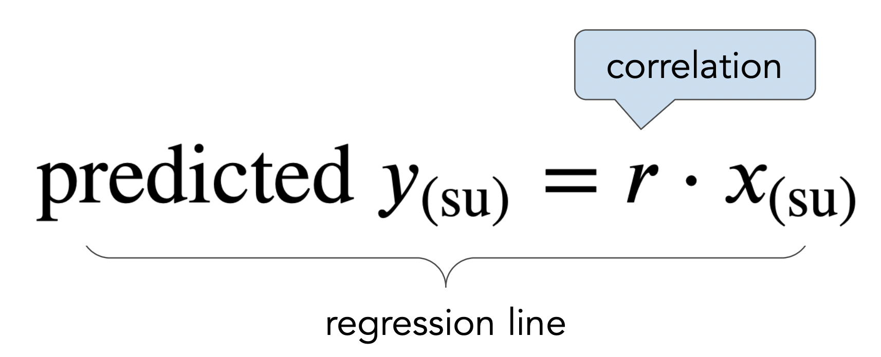
  • We use the regression line to make predictions!

Making predictions in standard units

  • If $r = 0.32$, and the given $x$ is $2$ in standard units, then the prediction for $y$ is $0.64$ standard units.
    • The regression line predicts that a mother whose height is $2$ SDs above average has a son whose height is $0.64$ SDs above average.
  • If $r = 0.32$, and the given $x$ is $-1$ in standard units, then the prediction for $y$ is $-0.32$ standard units.
  • The regression line always predicts that a son will be somewhat closer to average in height than his mother. This effect is called regression to the mean, and is where the term regression comes from.
    • This is a consequence of the slope $r$ having a magnitude less than 1.
    • It is not saying that a son has to be closer to average in height than his mother; that's just what it predicts.
  • The regression line passes through the origin $(0, 0)$ in standard units. This means that, no matter what $r$ is, for an average $x$ value, we predict an average $y$ value.

Making predictions in original units

Ideally, we'd like to be able to predict a son's height in inches, not just in standard units. Given a mother's height in inches, here's how we'll predict her son's height in inches:

  1. Convert the mother's height from inches to standard units.
$$x_{i \: \text{(su)}} = \frac{x_i - \text{mean of $x$}}{\text{SD of $x$}}$$
  1. Multiply by the correlation coefficient to predict the son's height in standard units.
$$\text{predicted } y_{i \: \text{(su)}} = r \cdot x_{i \: \text{(su)}}$$
  1. Convert the son's predicted height from standard units back to inches.
$$\text{predicted } y_i = \text{predicted } y_{i \: \text{(su)}} \cdot \text{SD of $y$} + \text{mean of $y$}$$

Let's try it!

In [31]:
mom_mean = mom_son.get('mom').mean()
mom_sd = np.std(mom_son.get('mom'))
son_mean = mom_son.get('son').mean()
son_sd = np.std(mom_son.get('son'))
In [32]:
def predict_with_r(mom):
    """Return a prediction for the height of a son whose mother has height mom, 
    using linear regression.
    """
    mom_su = (mom - mom_mean) / mom_sd
    son_su = r_mom_son * mom_su
    return son_su * son_sd + son_mean
In [33]:
predict_with_r(68)
Out[33]:
70.68219686848828
In [34]:
predict_with_r(60)
Out[34]:
67.76170758654767
In [35]:
preds = mom_son.assign(
    predicted_height=mom_son.get('mom').apply(predict_with_r)
)
ax = preds.plot(kind='scatter', x='mom', y='son', title='Regression line predictions, in original units', figsize=(10, 5), label='original data')
preds.plot(kind='line', x='mom', y='predicted_height', ax=ax, color='orange', label='regression line', lw=4);
plt.legend();
2023-11-29T01:03:25.203293 image/svg+xml Matplotlib v3.5.2, https://matplotlib.org/

Concept Check ✅ – Answer at cc.dsc10.com

A course has a midterm (mean 80, standard deviation 15) and a really hard final (mean 50, standard deviation 12).

If the scatter plot comparing midterm & final scores for students looks linearly associated with correlation 0.75, then what is the predicted final exam score for a student who received a 90 on the midterm?

  • A. 54
  • B. 56
  • C. 58
  • D. 60
  • E. 62

Summary, next time

Summary

  • The correlation coefficient, $r$, measures the strength of the linear association between two variables $x$ and $y$. It ranges between -1 and 1.
  • When both variables are measured in standard units, the regression line is the straight line passing through $(0, 0)$ with slope $r$. We can use it to make predictions for a $y$ value (e.g. son's height) given an $x$ value (e.g. mother's height).

Next time

More on regression, including:

  • What is the equation of the regression line in original units (e.g. inches)?
  • In what sense is the regression line the "best" line for making predictions?