
# Set up packages for lecture. Don't worry about understanding this code, but
# make sure to run it if you're following along.
import numpy as np
import babypandas as bpd
import pandas as pd

import matplotlib.pyplot as plt
from matplotlib_inline.backend_inline import set_matplotlib_formats
set_matplotlib_formats("svg")
plt.style.use('ggplot')
plt.rcParams['figure.figsize'] = (10, 5)

np.set_printoptions(threshold=20, precision=2, suppress=True)
pd.set_option("display.max_rows", 7)
pd.set_option("display.max_columns", 8)
pd.set_option("display.precision", 2)

from IPython.display import display, IFrame, YouTubeVideo

def show_grouping_animation():
    src = "https://docs.google.com/presentation/d/e/2PACX-1vTgVlFngQcLMYHP-z1vq5lVXjsBgcHebc-3TX7SW6L_gjX6TD1gsflvVDQUpWiDdeEPqJASenUIfBVd/embed?start=false&loop=false&delayms=60000"
    width = 960
    height = 509
    display(IFrame(src, width, height))

import warnings
warnings.simplefilter('ignore')
There are several keyboard shortcuts built into Jupyter Notebooks designed to help you save time. To see them, either click the keyboard button in the toolbar above or hit the H key on your keyboard (as long as you're not actively editing a cell).
Particularly useful shortcuts:
| Action | Keyboard shortcut |
|---|---|
| Run cell + jump to next cell | SHIFT + ENTER |
| Save the notebook | CTRL/CMD + S |
| Create new cell above/below | A/B |
| Delete cell | DD |
show_grouping_animation()
Run the cell below to load in the requests DataFrame from last class.
requests = bpd.read_csv('data/get-it-done-requests.csv')
requests = requests.assign(total=requests.get('closed') + requests.get('open'))
requests
| neighborhood | service | closed | open | total | |
|---|---|---|---|---|---|
| 0 | Balboa Park | Dead Animal | 11 | 0 | 11 |
| 1 | Balboa Park | Development Services - Code Enforcement | 2 | 0 | 2 |
| 2 | Balboa Park | Encampment | 215 | 20 | 235 |
| ... | ... | ... | ... | ... | ... |
| 1418 | Via De La Valle | Pothole | 11 | 7 | 18 |
| 1419 | Via De La Valle | Sidewalk Repair Issue | 0 | 1 | 1 |
| 1420 | Via De La Valle | Street Sweeping | 1 | 0 | 1 |
1421 rows × 5 columns
requests.groupby('neighborhood').sum()
| closed | open | total | |
|---|---|---|---|
| neighborhood | |||
| Balboa Park | 1173 | 261 | 1434 |
| Barrio Logan | 1185 | 201 | 1386 |
| Black Mountain Ranch | 151 | 44 | 195 |
| ... | ... | ... | ... |
| University | 1614 | 620 | 2234 |
| Uptown | 5654 | 1691 | 7345 |
| Via De La Valle | 13 | 12 | 25 |
57 rows × 3 columns
# Note the use of .index – remember, the index isn't a column!
(
    requests
    .groupby('neighborhood')
    .sum()
    .sort_values(by='total', ascending=False)
    .index[0]
)
'Downtown'
How do we find the number of different services requested in each neighborhood?
As always when using groupby, there are two steps:
'neighborhood' seems like a good choice..count(), .sum(), .mean(), .median(), .max(), and .min().# How many different requests are there for the neighborhood 'University'?
requests[requests.get('neighborhood') == 'University']
| neighborhood | service | closed | open | total | |
|---|---|---|---|---|---|
| 1354 | University | Dead Animal | 25 | 0 | 25 |
| 1355 | University | Development Services - Code Enforcement | 7 | 2 | 9 |
| 1356 | University | Encampment | 55 | 27 | 82 |
| ... | ... | ... | ... | ... | ... |
| 1381 | University | Tree Maintenance | 47 | 8 | 55 |
| 1382 | University | Waste on Private Property | 5 | 1 | 6 |
| 1383 | University | Weed Cleanup | 1 | 4 | 5 |
30 rows × 5 columns
# How do we find this result for every neighborhood?
The column names of the output of .groupby don't make sense when using the .count() aggregation method.
num_diff_services = requests.groupby('neighborhood').count()
num_diff_services
| service | closed | open | total | |
|---|---|---|---|---|
| neighborhood | ||||
| Balboa Park | 28 | 28 | 28 | 28 |
| Barrio Logan | 28 | 28 | 28 | 28 |
| Black Mountain Ranch | 24 | 24 | 24 | 24 |
| ... | ... | ... | ... | ... |
| University | 30 | 30 | 30 | 30 |
| Uptown | 31 | 31 | 31 | 31 |
| Via De La Valle | 6 | 6 | 6 | 6 |
57 rows × 4 columns
Consider dropping unneeded columns and renaming columns as follows:
.assign to create a new column containing the same values as the old column(s)..drop(columns=list_of_column_labels) to drop the old column(s). Alternatively, use .get(list_of_column_labels) to keep only the columns in the given list. The columns will appear in the order you specify, so this is also useful for reordering columns!num_diff_services = num_diff_services.assign(
count_of_services=num_diff_services.get('open')
).drop(columns=['service', 'closed', 'open', 'total'])
num_diff_services
| count_of_services | |
|---|---|
| neighborhood | |
| Balboa Park | 28 |
| Barrio Logan | 28 |
| Black Mountain Ranch | 24 |
| ... | ... |
| University | 30 |
| Uptown | 31 |
| Via De La Valle | 6 |
57 rows × 1 columns
Run these cells to load the Little Women data from Lecture 1.
chapters = open('data/lw.txt').read().split('CHAPTER ')[1:]
# Counts of names in the chapters of Little Women.

counts = bpd.DataFrame().assign(
    Amy=np.char.count(chapters, 'Amy'),
    Beth=np.char.count(chapters, 'Beth'),
    Jo=np.char.count(chapters, 'Jo'),
    Meg=np.char.count(chapters, 'Meg'),
    Laurie=np.char.count(chapters, 'Laurie'),
)

# Cumulative number of times each name appears.

lw_counts = bpd.DataFrame().assign(
    Amy=np.cumsum(counts.get('Amy')),
    Beth=np.cumsum(counts.get('Beth')),
    Jo=np.cumsum(counts.get('Jo')),
    Meg=np.cumsum(counts.get('Meg')),
    Laurie=np.cumsum(counts.get('Laurie')),
    Chapter=np.arange(1, 48, 1)
)

lw_counts
| Amy | Beth | Jo | Meg | Laurie | Chapter | |
|---|---|---|---|---|---|---|
| 0 | 23 | 26 | 44 | 26 | 0 | 1 |
| 1 | 36 | 38 | 65 | 46 | 0 | 2 |
| 2 | 38 | 40 | 127 | 82 | 16 | 3 |
| ... | ... | ... | ... | ... | ... | ... |
| 44 | 633 | 461 | 1450 | 675 | 581 | 45 |
| 45 | 635 | 462 | 1506 | 679 | 583 | 46 |
| 46 | 645 | 465 | 1543 | 685 | 596 | 47 |
47 rows × 6 columns
In Lecture 1, we were able to answer questions about the plot of Little Women without having to read the novel and without having to understand Python code. Some of those questions included:
We answered these questions from a data visualization alone!
lw_counts.plot(x='Chapter');
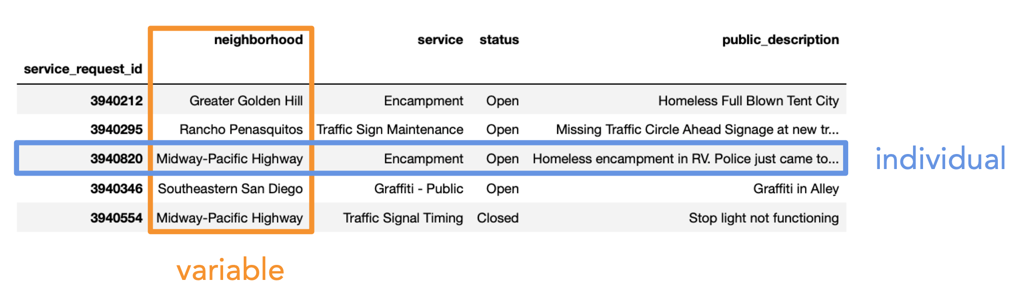
There are two main types of variables:
Note that here, "variable" does not mean a variable in Python, but rather it means a column in a DataFrame.
Which of these is not a numerical variable?
A. Fuel economy in miles per gallon.
B. Number of quarters at UCSD.
C. College at UCSD (Sixth, Seventh, etc).
D. Bank account number.
E. More than one of these are not numerical variables.
The type of visualization we create depends on the kinds of variables we're visualizing.
We may interchange the words "plot", "chart", and "graph"; they all mean the same thing.
| Column | Contents |
|---|---|
'Actor'|Name of actor
'Total Gross'| Total gross domestic box office receipt, in millions of dollars, of all of the actor’s movies
'Number of Movies'| The number of movies the actor has been in
'Average per Movie'| Total gross divided by number of movies
'#1 Movie'| The highest grossing movie the actor has been in
'Gross'| Gross domestic box office receipt, in millions of dollars, of the actor’s #1 Movie
actors = bpd.read_csv('data/actors.csv').set_index('Actor')
actors
| Total Gross | Number of Movies | Average per Movie | #1 Movie | Gross | |
|---|---|---|---|---|---|
| Actor | |||||
| Harrison Ford | 4871.7 | 41 | 118.8 | Star Wars: The Force Awakens | 936.7 |
| Samuel L. Jackson | 4772.8 | 69 | 69.2 | The Avengers | 623.4 |
| Morgan Freeman | 4468.3 | 61 | 73.3 | The Dark Knight | 534.9 |
| ... | ... | ... | ... | ... | ... |
| Sandra Bullock | 2462.6 | 35 | 70.4 | Minions | 336.0 |
| Chris Evans | 2457.8 | 23 | 106.9 | The Avengers | 623.4 |
| Anne Hathaway | 2416.5 | 25 | 96.7 | The Dark Knight Rises | 448.1 |
50 rows × 5 columns
What is the relationship between 'Number of Movies' and 'Total Gross'?
actors.plot(kind='scatter', x='Number of Movies', y='Total Gross');
df, use
df.plot(
  kind='scatter',
  x=x_column_for_horizontal,
  y=y_column_for_vertical
)df..plot, it will hide the weird text output that displays.What is the relationship between 'Number of Movies' and 'Average per Movie'?
actors.plot(kind='scatter', x='Number of Movies', y='Average per Movie');
Note that in the above plot, there's a negative association and an outlier.
actors[actors.get('Number of Movies') >= 60]
| Total Gross | Number of Movies | Average per Movie | #1 Movie | Gross | |
|---|---|---|---|---|---|
| Actor | |||||
| Samuel L. Jackson | 4772.8 | 69 | 69.2 | The Avengers | 623.4 |
| Morgan Freeman | 4468.3 | 61 | 73.3 | The Dark Knight | 534.9 |
| Bruce Willis | 3189.4 | 60 | 53.2 | Sixth Sense | 293.5 |
| Robert DeNiro | 3081.3 | 79 | 39.0 | Meet the Fockers | 279.3 |
| Liam Neeson | 2942.7 | 63 | 46.7 | The Phantom Menace | 474.5 |
Whoever they are, they made very few, high grossing movies.
actors[actors.get('Number of Movies') < 10]
| Total Gross | Number of Movies | Average per Movie | #1 Movie | Gross | |
|---|---|---|---|---|---|
| Actor | |||||
| Anthony Daniels | 3162.9 | 7 | 451.8 | Star Wars: The Force Awakens | 936.7 |

| Column | Content |
|---|---|
'Year'| Year
'Total Gross in Billions'| Total domestic box office gross, in billions of dollars, of all movies released
'Number of Movies'| Number of movies released
'#1 Movie'| Highest grossing movie
movies_by_year = bpd.read_csv('data/movies_by_year.csv').set_index('Year')
movies_by_year
| Total Gross in Billions | Number of Movies | #1 Movie | |
|---|---|---|---|
| Year | |||
| 2022 | 5.64 | 380 | Top Gun: Maverick |
| 2021 | 4.48 | 439 | Spider-Man: No Way Home |
| 2020 | 2.11 | 456 | Bad Boys for Life |
| ... | ... | ... | ... |
| 1979 | 1.23 | 40 | Superman |
| 1978 | 0.83 | 13 | Grease |
| 1977 | 0.44 | 9 | Star Wars: Episode IV - A New Hope |
46 rows × 3 columns
How has the number of movies changed over time? 🤔
movies_by_year.plot(kind='line', y='Number of Movies');
df, use
df.plot(
  kind='line',
  x=x_column_for_horizontal,
  y=y_column_for_vertical
)x= argument!movies_by_year.plot(kind='line', y='Number of Movies');
We can create a line plot of just 2000 onwards by querying movies_by_year before calling .plot.
movies_by_year[movies_by_year.index >= 2000].plot(kind='line', y='Number of Movies');
What do you think explains the declines around 2008 and 2020?
movies_by_year[movies_by_year.index >= 2000].plot(kind='line', y='Total Gross in Billions');
...
Ellipsis
If you're curious how line plots work under the hood, watch this video we made a few quarters ago.
YouTubeVideo('glzZ04D1kDg')
charts = (bpd.read_csv('data/regional-us-daily-2023-04-13.csv')
          .set_index('rank')
          .get(['track_name', 'artist_names', 'streams', 'uri'])
         )
charts
| track_name | artist_names | streams | uri | |
|---|---|---|---|---|
| rank | ||||
| 1 | Last Night | Morgan Wallen | 1801636 | spotify:track:7K3BhSpAxZBznislvUMVtn |
| 2 | Search & Rescue | Drake | 1515162 | spotify:track:7aRCf5cLOFN1U7kvtChY1G |
| 3 | Kill Bill | SZA | 1412326 | spotify:track:1Qrg8KqiBpW07V7PNxwwwL |
| ... | ... | ... | ... | ... |
| 198 | Redbone | Childish Gambino | 291222 | spotify:track:0wXuerDYiBnERgIpbb3JBR |
| 199 | You're On Your Own, Kid | Taylor Swift | 290995 | spotify:track:4D7BCuvgdJlYvlX5WlN54t |
| 200 | Fall In Love | Bailey Zimmerman | 290535 | spotify:track:5gVCfYmQRPy1QJifP8f5gg |
200 rows × 4 columns
How many streams do the top 10 songs have?
charts
| track_name | artist_names | streams | uri | |
|---|---|---|---|---|
| rank | ||||
| 1 | Last Night | Morgan Wallen | 1801636 | spotify:track:7K3BhSpAxZBznislvUMVtn |
| 2 | Search & Rescue | Drake | 1515162 | spotify:track:7aRCf5cLOFN1U7kvtChY1G |
| 3 | Kill Bill | SZA | 1412326 | spotify:track:1Qrg8KqiBpW07V7PNxwwwL |
| ... | ... | ... | ... | ... |
| 198 | Redbone | Childish Gambino | 291222 | spotify:track:0wXuerDYiBnERgIpbb3JBR |
| 199 | You're On Your Own, Kid | Taylor Swift | 290995 | spotify:track:4D7BCuvgdJlYvlX5WlN54t |
| 200 | Fall In Love | Bailey Zimmerman | 290535 | spotify:track:5gVCfYmQRPy1QJifP8f5gg |
200 rows × 4 columns
charts.take(np.arange(10))
| track_name | artist_names | streams | uri | |
|---|---|---|---|---|
| rank | ||||
| 1 | Last Night | Morgan Wallen | 1801636 | spotify:track:7K3BhSpAxZBznislvUMVtn |
| 2 | Search & Rescue | Drake | 1515162 | spotify:track:7aRCf5cLOFN1U7kvtChY1G |
| 3 | Kill Bill | SZA | 1412326 | spotify:track:1Qrg8KqiBpW07V7PNxwwwL |
| ... | ... | ... | ... | ... |
| 8 | La Bebe - Remix | Yng Lvcas, Peso Pluma | 906832 | spotify:track:2UW7JaomAMuX9pZrjVpHAU |
| 9 | You Proof | Morgan Wallen | 833741 | spotify:track:5W4kiM2cUYBJXKRudNyxjW |
| 10 | Cupid - Twin Ver. | FIFTY FIFTY | 787840 | spotify:track:7FbrGaHYVDmfr7KoLIZnQ7 |
10 rows × 4 columns
charts.take(np.arange(10)).plot(kind='barh', x='track_name', y='streams');
df, use
df.plot(
  kind='barh',
  x=categorical_column_name,
  y=numerical_column_name
)'barh' stands for "horizontal".y='Streams' even though streams are measured by x-axis length.# The bars appear in the opposite order relative to the DataFrame.
(charts
.take(np.arange(10))
.sort_values(by='streams')
.plot(kind='barh', x='track_name', y='streams')
);
# Change "barh" to "bar" to get a vertical bar chart. These are a little harder to read.
(charts
 .take(np.arange(10))
 .sort_values(by='streams')
 .plot(kind='bar', x='track_name', y='streams')
);
(charts
 [charts.get('artist_names') == 'The Weeknd']
 .sort_values('streams')
 .plot(kind='barh', x='track_name', y='streams')
);
It seems like we're missing some popular songs...
Answer: Using .str.contains.
weeknd = charts[charts.get('artist_names').str.contains('The Weeknd')]
weeknd
| track_name | artist_names | streams | uri | |
|---|---|---|---|---|
| rank | ||||
| 12 | Creepin' (with The Weeknd & 21 Savage) | Metro Boomin, The Weeknd, 21 Savage | 783095 | spotify:track:2dHHgzDwk4BJdRwy9uXhTO |
| 26 | Die For You | The Weeknd | 658995 | spotify:track:2LBqCSwhJGcFQeTHMVGwy3 |
| 41 | Die For You (with Ariana Grande) - Remix | The Weeknd, Ariana Grande | 572829 | spotify:track:4W4fNrZYkobj539TOWsLO2 |
| 97 | Starboy | The Weeknd, Daft Punk | 387522 | spotify:track:7MXVkk9YMctZqd1Srtv4MB |
| 110 | Stargirl Interlude | The Weeknd, Lana Del Rey | 373574 | spotify:track:5gDWsRxpJ2lZAffh5p7K0w |
| 171 | The Hills | The Weeknd | 312251 | spotify:track:7fBv7CLKzipRk6EC6TWHOB |
| 180 | Blinding Lights | The Weeknd | 305384 | spotify:track:0VjIjW4GlUZAMYd2vXMi3b |
weeknd.sort_values('streams').plot(kind='barh', x='track_name', y='streams');
# Run this cell, don't worry about what it does.
def show_spotify(uri):
    code = uri[uri.rfind(':')+1:]
    src = f"https://open.spotify.com/embed/track/{code}"
    width = 400
    height = 75
    display(IFrame(src, width, height))
charts
| track_name | artist_names | streams | uri | |
|---|---|---|---|---|
| rank | ||||
| 1 | Last Night | Morgan Wallen | 1801636 | spotify:track:7K3BhSpAxZBznislvUMVtn |
| 2 | Search & Rescue | Drake | 1515162 | spotify:track:7aRCf5cLOFN1U7kvtChY1G |
| 3 | Kill Bill | SZA | 1412326 | spotify:track:1Qrg8KqiBpW07V7PNxwwwL |
| ... | ... | ... | ... | ... |
| 198 | Redbone | Childish Gambino | 291222 | spotify:track:0wXuerDYiBnERgIpbb3JBR |
| 199 | You're On Your Own, Kid | Taylor Swift | 290995 | spotify:track:4D7BCuvgdJlYvlX5WlN54t |
| 200 | Fall In Love | Bailey Zimmerman | 290535 | spotify:track:5gVCfYmQRPy1QJifP8f5gg |
200 rows × 4 columns
favorite_song = 'Die For You (with Ariana Grande) - Remix'
song_uri = (charts
            [charts.get('track_name') == favorite_song]
            .get('uri')
            .iloc[0])
song_uri
'spotify:track:4W4fNrZYkobj539TOWsLO2'
Watch what happens! 🎶
show_spotify(song_uri)
Try it out yourself!