The regression line
- The regression line is the line through $(0,0)$ with slope $r$, when both variables are measured in standard units.
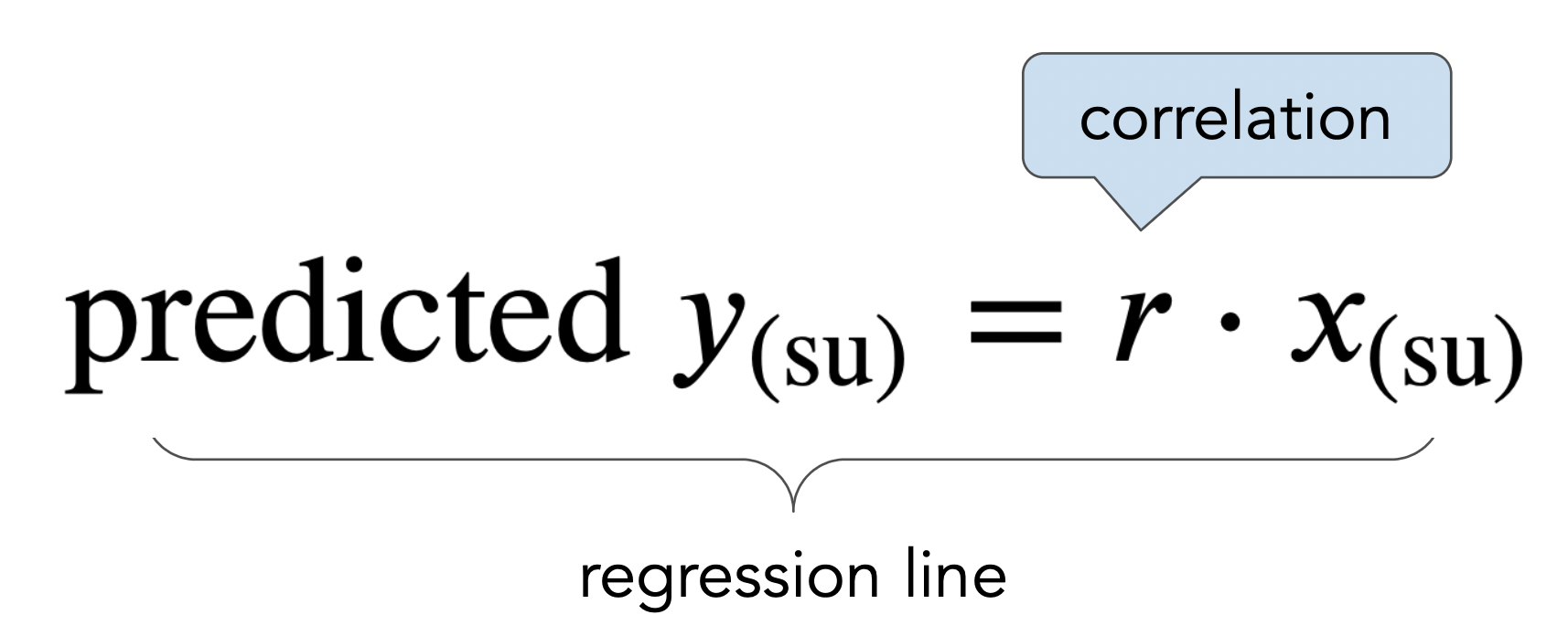
- We use the regression line to make predictions!
# Set up packages for lecture. Don't worry about understanding this code,
# but make sure to run it if you're following along.
import numpy as np
import babypandas as bpd
import pandas as pd
from matplotlib_inline.backend_inline import set_matplotlib_formats
import matplotlib.pyplot as plt
set_matplotlib_formats("svg")
plt.style.use('ggplot')

plt.rcParams['figure.figsize'] = (10, 5)

np.set_printoptions(threshold=20, precision=2, suppress=True)
pd.set_option("display.max_rows", 7)
pd.set_option("display.max_columns", 8)
pd.set_option("display.precision", 2)

# Animations
from IPython.display import display
import ipywidgets as widgets

import warnings
warnings.filterwarnings('ignore')

# Demonstration code
def r_scatter(r):
    "Generate a scatter plot with a correlation approximately r"
    x = np.random.normal(0, 1, 1000)
    z = np.random.normal(0, 1, 1000)
    y = r * x + (np.sqrt(1 - r ** 2)) * z
    plt.scatter(x, y)
    plt.xlim(-4, 4)
    plt.ylim(-4, 4)

def show_scatter_grid():
    plt.subplots(1, 4, figsize=(10, 2))
    for i, r in enumerate([-1, -2/3, -1/3, 0]):
        plt.subplot(1, 4, i+1)
        r_scatter(r)
        plt.title(f'r = {np.round(r, 2)}')
    plt.show()
    plt.subplots(1, 4, figsize=(10, 2))
    for i, r in enumerate([1, 2/3, 1/3]):
        plt.subplot(1, 4, i+1)
        r_scatter(r)
        plt.title(f'r = {np.round(r, 2)}')
    plt.subplot(1, 4, 4)
    plt.axis('off')
    plt.show()
Remember to review the end of Lecture 23 for a high-level summary of the second half of the class so far.
hybrid = bpd.read_csv('data/hybrid.csv')
hybrid
| vehicle | year | price | acceleration | mpg | class | |
|---|---|---|---|---|---|---|
| 0 | Prius (1st Gen) | 1997 | 24509.74 | 7.46 | 41.26 | Compact |
| 1 | Tino | 2000 | 35354.97 | 8.20 | 54.10 | Compact |
| 2 | Prius (2nd Gen) | 2000 | 26832.25 | 7.97 | 45.23 | Compact |
| ... | ... | ... | ... | ... | ... | ... |
| 150 | C-Max Energi Plug-in | 2013 | 32950.00 | 11.76 | 43.00 | Midsize |
| 151 | Fusion Energi Plug-in | 2013 | 38700.00 | 11.76 | 43.00 | Midsize |
| 152 | Chevrolet Volt | 2013 | 39145.00 | 11.11 | 37.00 | Compact |
153 rows × 6 columns
'price' vs. 'acceleration'¶Is there an association between these two variables? If so, what kind?
hybrid.plot(kind='scatter', x='acceleration', y='price');
'price' vs. 'mpg'¶Is there an association between these two variables? If so, what kind?
hybrid.plot(kind='scatter', x='mpg', y='price');
Observations:
hybrid.assign(
    km_per_liter=hybrid.get('mpg') * 0.425144,
    yen=hybrid.get('price') * 139.77
).plot(kind='scatter', x='km_per_liter', y='yen');
def standard_units(any_numbers):
    "Convert any array of numbers to standard units."
    any_numbers = np.array(any_numbers)
    return (any_numbers - any_numbers.mean()) / np.std(any_numbers)
def standardize(df):
    """Return a DataFrame in which all columns of df are converted to standard units."""
    df_su = bpd.DataFrame()
    for column in df.columns:
        df_su = df_su.assign(**{column + ' (su)': standard_units(df.get(column))})
    return df_su
For a given pair of variables:
hybrid_su = standardize(hybrid.get(['price', 'acceleration', 'mpg'])).assign(vehicle=hybrid.get('vehicle'))
hybrid_su
| price (su) | acceleration (su) | mpg (su) | vehicle | |
|---|---|---|---|---|
| 0 | -6.94e-01 | -1.54 | 0.59 | Prius (1st Gen) |
| 1 | -1.86e-01 | -1.28 | 1.76 | Tino |
| 2 | -5.85e-01 | -1.36 | 0.95 | Prius (2nd Gen) |
| ... | ... | ... | ... | ... |
| 150 | -2.98e-01 | -0.07 | 0.75 | C-Max Energi Plug-in |
| 151 | -2.90e-02 | -0.07 | 0.75 | Fusion Energi Plug-in |
| 152 | -8.17e-03 | -0.29 | 0.20 | Chevrolet Volt |
153 rows × 4 columns
'price' vs. 'acceleration'¶hybrid_su.plot(kind='scatter', x='acceleration (su)', y='price (su)');
Which cars have 'acceleration's and 'price's that are more than 2 SDs above average?
hybrid_su[(hybrid_su.get('acceleration (su)') > 2) &
          (hybrid_su.get('price (su)') > 2)]
| price (su) | acceleration (su) | mpg (su) | vehicle | |
|---|---|---|---|---|
| 47 | 2.71 | 2.05 | -1.46 | ActiveHybrid X6 |
| 60 | 3.04 | 2.88 | -1.16 | ActiveHybrid 7 |
| 95 | 2.96 | 2.12 | -1.35 | ActiveHybrid 7i |
| 146 | 2.11 | 2.12 | -0.90 | ActiveHybrid 7L |
| 147 | 2.66 | 2.24 | -0.90 | Panamera S |
'price' vs. 'mpg'¶hybrid_su.plot(kind='scatter', x='mpg (su)', y='price (su)');
Which cars have close to average 'mpg's and close to average 'price's?
hybrid_su[(hybrid_su.get('mpg (su)') <= 0.3) &
          (hybrid_su.get('mpg (su)') >= -0.3) &
          (hybrid_su.get('price (su)') <= 0.3) &
          (hybrid_su.get('price (su)') >= -0.3)]
| price (su) | acceleration (su) | mpg (su) | vehicle | |
|---|---|---|---|---|
| 10 | -1.24e-01 | -0.56 | -0.26 | Escape |
| 22 | -2.13e-01 | -1.02 | -0.17 | Mercury Mariner |
| 57 | -8.47e-02 | 0.72 | -0.11 | Audi Q5 |
| ... | ... | ... | ... | ... |
| 70 | -2.14e-01 | -0.07 | 0.02 | HS 250h |
| 102 | -2.69e-03 | -0.29 | 0.20 | Chevrolet Volt |
| 152 | -8.17e-03 | -0.29 | 0.20 | Chevrolet Volt |
8 rows × 4 columns
The correlation coefficient $r$ of two variables $x$ and $y$ is defined as the
If x and y are two Series or arrays,
r = (x_su * y_su).mean()
where x_su and y_su are x and y converted to standard units.
def calculate_r(df, x, y):
    x_su = df.get(x + ' (su)')
    y_su = df.get(y + ' (su)')
    return (x_su * y_su).mean()
Let's calculate $r$ for 'acceleration' and 'price'.
hybrid_su
| price (su) | acceleration (su) | mpg (su) | vehicle | |
|---|---|---|---|---|
| 0 | -6.94e-01 | -1.54 | 0.59 | Prius (1st Gen) |
| 1 | -1.86e-01 | -1.28 | 1.76 | Tino |
| 2 | -5.85e-01 | -1.36 | 0.95 | Prius (2nd Gen) |
| ... | ... | ... | ... | ... |
| 150 | -2.98e-01 | -0.07 | 0.75 | C-Max Energi Plug-in |
| 151 | -2.90e-02 | -0.07 | 0.75 | Fusion Energi Plug-in |
| 152 | -8.17e-03 | -0.29 | 0.20 | Chevrolet Volt |
153 rows × 4 columns
r_acc_price = calculate_r(hybrid_su, 'acceleration', 'price')
r_acc_price
0.6955778996913982
hybrid_su.plot(kind='scatter', x='acceleration (su)', y='price (su)')
plt.axvline(0, color='black');
plt.axhline(0, color='black');
Note that the correlation is positive, and most data points fall in the lower left and upper right quadrants!
Let's now calculate $r$ for 'mpg' and 'price'.
hybrid_su
| price (su) | acceleration (su) | mpg (su) | vehicle | |
|---|---|---|---|---|
| 0 | -6.94e-01 | -1.54 | 0.59 | Prius (1st Gen) |
| 1 | -1.86e-01 | -1.28 | 1.76 | Tino |
| 2 | -5.85e-01 | -1.36 | 0.95 | Prius (2nd Gen) |
| ... | ... | ... | ... | ... |
| 150 | -2.98e-01 | -0.07 | 0.75 | C-Max Energi Plug-in |
| 151 | -2.90e-02 | -0.07 | 0.75 | Fusion Energi Plug-in |
| 152 | -8.17e-03 | -0.29 | 0.20 | Chevrolet Volt |
153 rows × 4 columns
r_mpg_price = calculate_r(hybrid_su, 'mpg', 'price')
r_mpg_price
-0.5318263633683789
hybrid_su.plot(kind='scatter', x='mpg (su)', y='price (su)');
plt.axvline(0, color='black');
plt.axhline(0, color='black');
Note that the correlation is negative, and most data points fall in the upper left and lower right quadrants!
show_scatter_grid()
Which of the following does the scatter plot below show?
x2 = bpd.DataFrame().assign(
    x=np.arange(-6, 6.1, 0.5),
    y=np.arange(-6, 6.1, 0.5) ** 2
)
x2.plot(kind='scatter', x='x', y='y');
The data below was collected in the late 1800s by Francis Galton.
galton = bpd.read_csv('data/galton.csv')
galton
| family | father | mother | midparentHeight | children | childNum | gender | childHeight | |
|---|---|---|---|---|---|---|---|---|
| 0 | 1 | 78.5 | 67.0 | 75.43 | 4 | 1 | male | 73.2 |
| 1 | 1 | 78.5 | 67.0 | 75.43 | 4 | 2 | female | 69.2 |
| 2 | 1 | 78.5 | 67.0 | 75.43 | 4 | 3 | female | 69.0 |
| ... | ... | ... | ... | ... | ... | ... | ... | ... |
| 931 | 203 | 62.0 | 66.0 | 66.64 | 3 | 3 | female | 61.0 |
| 932 | 204 | 62.5 | 63.0 | 65.27 | 2 | 1 | male | 66.5 |
| 933 | 204 | 62.5 | 63.0 | 65.27 | 2 | 2 | female | 57.0 |
934 rows × 8 columns
Let's just consider the relationship between mothers' heights and their adult sons' heights.
male_children = galton[galton.get('gender') == 'male']
mom_son = bpd.DataFrame().assign(mom = male_children.get('mother'),
                                 son = male_children.get('childHeight'))
mom_son
| mom | son | |
|---|---|---|
| 0 | 67.0 | 73.2 |
| 4 | 66.5 | 73.5 |
| 5 | 66.5 | 72.5 |
| ... | ... | ... |
| 925 | 60.0 | 66.0 |
| 929 | 66.0 | 64.0 |
| 932 | 63.0 | 66.5 |
481 rows × 2 columns
mom_son.plot(kind='scatter', x='mom', y='son');
'mom') and her son's height ('son'). 'mom' and 'son'. mom_son_su = standardize(mom_son)
mom_son_su.plot(kind='scatter', x='mom (su)', y='son (su)');
r_mom_son = calculate_r(mom_son_su, 'mom', 'son')
r_mom_son
0.32300498368490554
def constant_prediction(prediction):
    mom_son_su.plot(kind='scatter', x='mom (su)', y='son (su)', title=f'Predicting a height of {prediction} SUs for all sons', figsize=(10, 5));
    plt.axhline(prediction, color='orange', lw=4);
    plt.xlim(-3, 3)
    plt.show()

prediction = widgets.FloatSlider(value=-3, min=-3,max=3,step=0.5, description='prediction')
ui = widgets.HBox([prediction])
out = widgets.interactive_output(constant_prediction, {'prediction': prediction})
display(ui, out)
HBox(children=(FloatSlider(value=-3.0, description='prediction', max=3.0, min=-3.0, step=0.5),))
Output()
mom_son_su.plot(kind='scatter', x='mom (su)', y='son (su)', title='A good prediction is the mean height of sons (0 SUs)', figsize=(10, 5));
plt.axhline(0, color='orange', lw=4);
plt.xlim(-3, 3);
def linear_prediction(slope):
    x = np.linspace(-3, 3)
    y = x * slope
    mom_son_su.plot(kind='scatter', x='mom (su)', y='son (su)', figsize=(10, 5));
    plt.plot(x, y, color='orange', lw=4)
    plt.xlim(-3, 3)
    plt.title(r"Predicting sons' heights using $\mathrm{son}_{\mathrm{(su)}}$ = " + str(np.round(slope, 2)) + r"$ \cdot \mathrm{mother}_{\mathrm{(su)}}$")
    plt.show()

slope = widgets.FloatSlider(value=0, min=-1,max=1,step=1/6, description='slope')
ui = widgets.HBox([slope])
out = widgets.interactive_output(linear_prediction, {'slope': slope})
display(ui, out)
HBox(children=(FloatSlider(value=0.0, description='slope', max=1.0, min=-1.0, step=0.16666666666666666),))
Output()
x = np.linspace(-3, 3)
y = x * r_mom_son
mom_son_su.plot(kind='scatter', x='mom (su)', y='son (su)', title=r'A good line goes through the origin and has slope $r$', figsize=(10, 5));
plt.plot(x, y, color='orange', label='regression line', lw=4)
plt.xlim(-3, 3)
plt.legend();
Of course, we'd like to be able to predict a son's height in inches, not just in standard units. Given a mother's height in inches, here's how we'll predict her son's height in inches:
Let's try it!
mom_mean = mom_son.get('mom').mean()
mom_sd = np.std(mom_son.get('mom'))
son_mean = mom_son.get('son').mean()
son_sd = np.std(mom_son.get('son'))
def predict_with_r(mom):
    """Return a prediction for the height of a son whose mother has height mom,
    using linear regression.
    """
    mom_su = (mom - mom_mean) / mom_sd
    son_su = r_mom_son * mom_su
    return son_su * son_sd + son_mean
predict_with_r(68)
70.68219686848828
predict_with_r(60)
67.76170758654767
preds = mom_son.assign(
    predicted_height=mom_son.get('mom').apply(predict_with_r)
)
ax = preds.plot(kind='scatter', x='mom', y='son', title='Regression line predictions, in original units', figsize=(10, 5), label='original data')
preds.plot(kind='line', x='mom', y='predicted_height', ax=ax, color='orange', label='regression line', lw=4);
plt.legend();
A course has a midterm (mean 80, standard deviation 15) and a really hard final (mean 50, standard deviation 12).
If the scatter plot comparing midterm & final scores for students looks linearly associated with correlation 0.75, then what is the predicted final exam score for a student who received a 90 on the midterm?
More on regression, including: