The regression line
- The regression line is the line through $(0,0)$ with slope $r$, when both variables are measured in standard units.
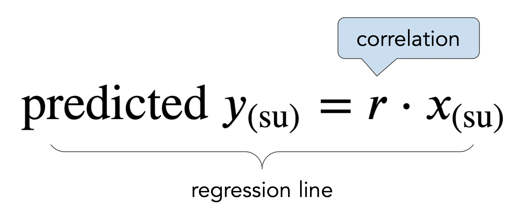
- We use the regression line to make predictions!
# Set up packages for lecture. Don't worry about understanding this code,
# but  sure to run it if you're following along.
import numpy as np
import babypandas as bpd
import pandas as pd
from matplotlib_inline.backend_inline import set_matplotlib_formats
import matplotlib.pyplot as plt
from scipy import stats
set_matplotlib_formats("svg")
plt.style.use('ggplot')

np.set_printoptions(threshold=20, precision=2, suppress=True)
pd.set_option("display.max_rows", 7)
pd.set_option("display.max_columns", 8)
pd.set_option("display.precision", 2)

import warnings
warnings.filterwarnings('ignore')

# New minimize function (wrapper around scipy.optimize.minimize)
from inspect import signature
from scipy import optimize

def minimize(function):
    n_args = len(signature(function).parameters)
    initial = np.zeros(n_args)
    return optimize.minimize(lambda x: function(*x), initial).x

# All of the following code is for visualization.
def plot_regression_line(df, x, y, margin=.02):
    '''Computes the slope and intercept of the regression line between columns x and y in df (in original units) and plots it.'''
    m = slope(df, x, y)
    b = intercept(df, x, y)

    df.plot(kind='scatter', x=x, y=y, s=100, figsize=(10, 5), label='original data')
    left = df.get(x).min()*(1 - margin)
    right = df.get(x).max()*(1 + margin)
    domain = np.linspace(left, right, 10)
    plt.plot(domain, m*domain + b, color='orange', label='regression line', lw=4)
    plt.suptitle(format_equation(m, b), fontsize=18)
    plt.legend();

def format_equation(m, b):
    if b > 0:
        return r'$y = %.2fx + %.2f$' % (m, b)
    elif b == 0:
        return r'$y = %.2fx' % m
    else:
        return r'$y = %.2fx %.2f$' % (m, b)

def plot_errors(df, m, b, ax=None):
    x = df.get('x')
    y = m * x + b
    df.plot(kind='scatter', x='x', y='y', s=100, label='original data', ax=ax, figsize=(10, 5) if ax is None else None)

    if ax:
        plotter = ax
    else:
        plotter = plt

    plotter.plot(x, y, color='orange', lw=4)

    for k in np.arange(df.shape[0]):
        xk = df.get('x').iloc[k]
        yk = np.asarray(y)[k]
        if k == df.shape[0] - 1:
            plotter.plot([xk, xk], [yk, df.get('y').iloc[k]], linestyle=(0, (1, 1)), c='r', lw=4, label='errors')
        else:
            plotter.plot([xk, xk], [yk, df.get('y').iloc[k]], linestyle=(0, (1, 1)), c='r', lw=4)

    plt.title(format_equation(m, b), fontsize=18)
    plt.xlim(50, 90)
    plt.ylim(40, 100)
    plt.legend();
Recall, in the last lecture, we aimed to use a mother's height to predict her adult son's height.
galton = bpd.read_csv('data/galton.csv')
male_children = galton[galton.get('gender') == 'male']
mom_son = bpd.DataFrame().assign(mom = male_children.get('mother'),
                                 son = male_children.get('childHeight'))
mom_son
| mom | son | |
|---|---|---|
| 0 | 67.0 | 73.2 |
| 4 | 66.5 | 73.5 |
| 5 | 66.5 | 72.5 |
| ... | ... | ... |
| 925 | 60.0 | 66.0 |
| 929 | 66.0 | 64.0 |
| 932 | 63.0 | 66.5 |
481 rows × 2 columns
mom_son.plot(kind='scatter', x='mom', y='son', figsize=(10, 5));
Recall, the correlation coefficient $r$ of two variables $x$ and $y$ is defined as the
def standard_units(any_numbers):
    "Convert a sequence of numbers to standard units."
    return (any_numbers - any_numbers.mean()) / np.std(any_numbers)

def correlation(df, x, y):
    "Computes the correlation between column x and column y of df."
    return (standard_units(df.get(x)) * standard_units(df.get(y))).mean()
r_mom_son = correlation(mom_son, 'mom', 'son')
r_mom_son
0.3230049836849053
Each time we wanted to predict the height of an adult son given the height of his mother, we had to:
This is inconvenient – wouldn't it be great if we could express the regression line itself in inches?
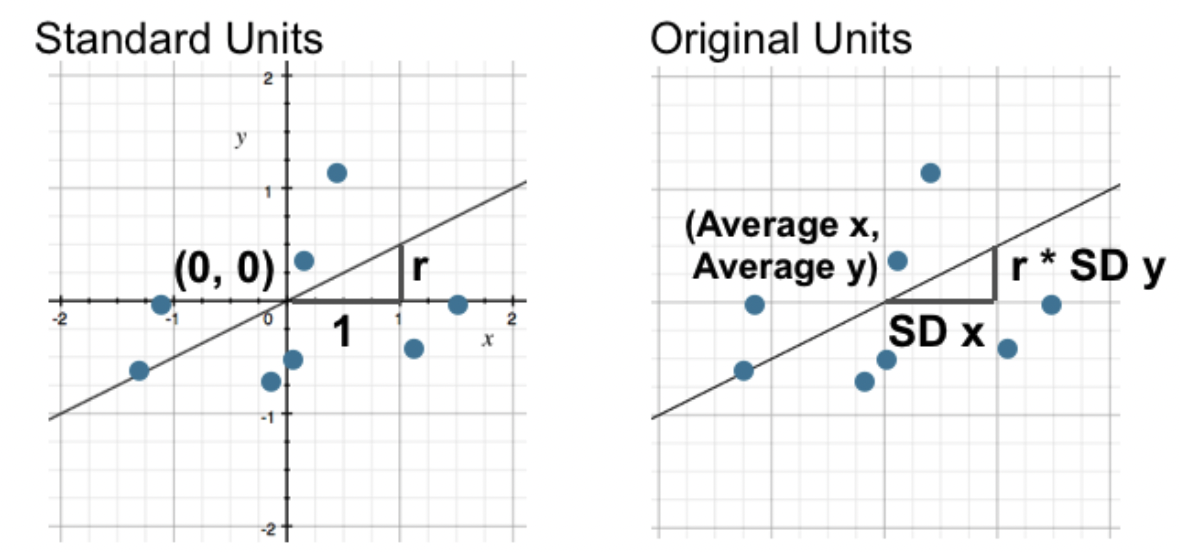
When $x$ and $y$ are in standard units, the regression line is given by
What is the regression line when $x$ and $y$ are in their original units (e.g. inches)?
Let's implement these formulas in code and try them out.
def slope(df, x, y):
    "Returns the slope of the regression line between columns x and y in df (in original units)."
    r = correlation(df, x, y)
    return r * np.std(df.get(y)) / np.std(df.get(x))

def intercept(df, x, y):
    "Returns the intercept of the regression line between columns x and y in df (in original units)."
    return df.get(y).mean() - slope(df, x, y) * df.get(x).mean()
Below, we compute the slope and intercept of the regression line between mothers' heights and sons' heights (in inches).
m_heights = slope(mom_son, 'mom', 'son')
m_heights
0.3650611602425757
b_heights = intercept(mom_son, 'mom', 'son')
b_heights
45.8580379719931
So, the regression line is
$$\text{predicted son's height in inches} = 0.365 \cdot \text{mother's height in inches} + 45.858$$def predict_son(mom):
return m_heights * mom + b_heights
What's the predicted height of a son whose mother is 62 inches tall?
predict_son(62)
68.4918299070328
What if the mother is 55 inches tall? 73 inches tall?
predict_son(55)
65.93640178533477
predict_son(73)
72.50750266970113
xs = np.arange(57, 72)
ys = predict_son(xs)
mom_son.plot(kind='scatter', x='mom', y='son', figsize=(10, 5), title='Regression line predictions, in original units', label='original data');
plt.plot(xs, ys, color='orange', lw=4, label='regression line')
plt.legend();
Consider the dataset below. What is the correlation between $x$ and $y$?
outlier = bpd.read_csv('data/outlier.csv')
outlier.plot(kind='scatter', x='x', y='y', s=100, figsize=(10, 5));
correlation(outlier, 'x', 'y')
-0.02793982443854448
plot_regression_line(outlier, 'x', 'y')
without_outlier = outlier[outlier.get('y') > 40]
correlation(without_outlier, 'x', 'y')
0.9851437295364018
plot_regression_line(without_outlier, 'x', 'y')
Takeaway: Even a single outlier can have a massive impact on the correlation, and hence the regression line. Look for these before performing regression. Always visualize first!
outlier.plot(kind='scatter', x='x', y='y', s=100, figsize=(10, 5));
m_no_outlier = slope(without_outlier, 'x', 'y')
b_no_outlier = intercept(without_outlier, 'x', 'y')

m_no_outlier, b_no_outlier
(0.9759277157245881, 3.042337135297416)
plot_errors(without_outlier, m_no_outlier, b_no_outlier)
We think our regression line is pretty good because most data points are pretty close to the regression line. The red lines are quite short.
without_outlier
| x | y | |
|---|---|---|
| 0 | 50 | 53.53 |
| 1 | 55 | 54.21 |
| 2 | 60 | 65.65 |
| ... | ... | ... |
| 6 | 80 | 79.61 |
| 7 | 85 | 88.17 |
| 8 | 90 | 91.05 |
9 rows × 2 columns
First, let's compute the regression line's predictions for the entire dataset.
predicted_y = m_no_outlier * without_outlier.get('x') + b_no_outlier
predicted_y
array([51.84, 56.72, 61.6 , 66.48, 71.36, 76.24, 81.12, 86. , 90.88])
To find the RMSE, we need to start by finding the errors and squaring them.
# Errors.
without_outlier.get('y') - predicted_y
0    1.69
1   -2.51
2    4.06
     ...
6   -1.51
7    2.18
8    0.18
Name: y, Length: 9, dtype: float64
# Squared errors.
(without_outlier.get('y') - predicted_y) ** 2
0     2.86
1     6.31
2    16.45
     ...
6     2.27
7     4.74
8     0.03
Name: y, Length: 9, dtype: float64
Now, we need to find the mean of the squared errors, and take the square root of that. The result is the RMSE of the regression line's predictions.
# Mean squared error.
((without_outlier.get('y') - predicted_y) ** 2).mean()
4.823770221019627
# Root mean squared error.
np.sqrt(((without_outlier.get('y') - predicted_y) ** 2).mean())
2.1963083164755415
The RMSE of the regression line's predictions is about 2.2. Is this big or small, relative to the predictions of other lines? 🤔
x using an arbitrary line defined by slope and intercept, compute x * slope + intercept.def rmse(slope, intercept):
'''Calculates the RMSE of the line with the given slope and intercept,
using the 'x' and 'y' columns of without_outlier.'''
# The true values of y.
true = without_outlier.get('y')
# The predicted values of y, from plugging the x values from the
# given DataFrame into the line with the given slope and intercept.
predicted = slope * without_outlier.get('x') + intercept
return np.sqrt(((true - predicted) ** 2).mean())
# Check that our function works on the regression line.
rmse(m_no_outlier, b_no_outlier)
2.1963083164755415
Let's compute the RMSEs of several different lines on the same dataset.
# Experiment by changing one of these!
lines = [(1.2, -15), (0.75, 11.5), (-0.4, 100)]

fig, ax = plt.subplots(1, 3, figsize=(14, 4))
for i, line in enumerate(lines):
    plt.subplot(1, 3, i + 1)
    m, b = line
    plot_errors(without_outlier, m, b, ax=ax[i])
    ax[i].set_title(format_equation(m, b) + f'\nRMSE={np.round(rmse(m, b), 2)}')
minimize. minimize¶minimize takes in a function as an argument, and returns the inputs to the function that produce the smallest output. minimize can find this, too:def f(x):
return (x - 5) ** 2 + 4
# Plot of f(x).
x = np.linspace(0, 10)
y = f(x)
plt.plot(x, y)
plt.title(r'$f(x) = (x - 5)^2 + 4$');
minimize(f)
array([5.])
minimize function uses calculus and intelligent trial-and-error to find these inputs; you don't need to know how it works under the hood.We'll use minimize on rmse, to find the slope and intercept of the line with the smallest RMSE.
smallest_rmse_line = minimize(rmse)
smallest_rmse_line
array([0.98, 3.04])
Do these numbers look familiar?
# The slope and intercept with the smallest RMSE, from our call to minimize.
m_smallest_rmse = smallest_rmse_line[0]
b_smallest_rmse = smallest_rmse_line[1]
m_smallest_rmse, b_smallest_rmse
(0.9759274555477827, 3.042355373020482)
# The slope and intercept according to our regression line formulas.
slope(without_outlier, 'x', 'y'), intercept(without_outlier, 'x', 'y')
(0.9759277157245881, 3.042337135297416)
The slopes and intercepts we got using both approaches look awfully similar... 👀
What's the regression line for this dataset?
np.random.seed(23)
x2 = bpd.DataFrame().assign(
    x=np.arange(-6, 6.1, 0.5) + np.random.normal(size=25),
    y=np.arange(-6, 6.1, 0.5)**2 + np.random.normal(size=25)
)
x2.plot(kind='scatter', x='x', y='y', s=100, figsize=(10, 5));
plot_regression_line(x2, 'x', 'y')
This line doesn't fit the data at all!