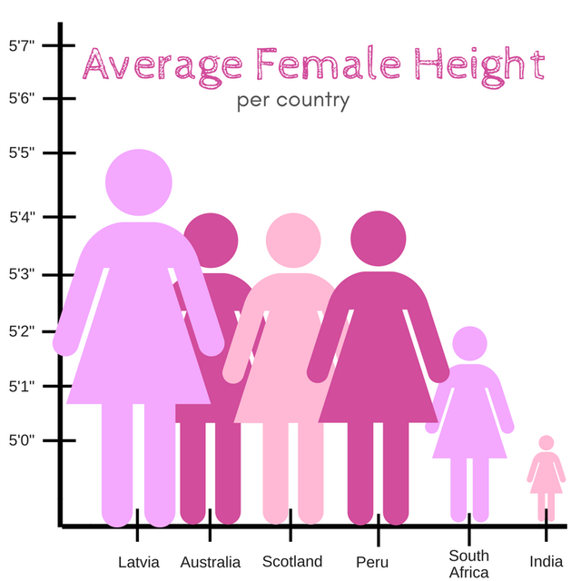
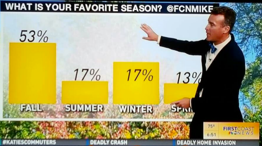
Some bad visualizations

# Set up packages for lecture. Don't worry about understanding this code, but
# make sure to run it if you're following along.
import numpy as np
import babypandas as bpd
import pandas as pd
from matplotlib_inline.backend_inline import set_matplotlib_formats
import matplotlib.pyplot as plt
set_matplotlib_formats("svg")
plt.style.use('ggplot')

np.set_printoptions(threshold=20, precision=2, suppress=True)
pd.set_option("display.max_rows", 7)
pd.set_option("display.max_columns", 8)
pd.set_option("display.precision", 2)

from IPython.display import display, IFrame

def binning_animation():
    src="https://docs.google.com/presentation/d/e/2PACX-1vTnRGwEnKP2V-Z82DlxW1b1nMb2F0zWyrXIzFSpQx_8Wd3MFaf56y2_u3JrLwZ5SjWmfapL5BJLfsDG/embed?start=false&loop=false&delayms=60000"
    width=900
    height=307
    display(IFrame(src, width, height))
str.contains().The type of visualization we create depends on the kinds of variables we're visualizing.
Note: We may interchange the words "plot", "chart", and "graph"; they all mean the same thing.


How often does a variable take on a certain value?
The distribution of a categorical variable can be displayed as a table or bar chart, among other ways! For example, let's look at the colleges of students enrolled in DSC 10 this quarter.
colleges = bpd.DataFrame().assign(College=['Seventh', 'Sixth', 'Roosevelt', 'Warren', 'Marshall', 'Muir', 'Revelle'],
                                  Students=[45, 81, 46, 41, 50, 42, 43])
colleges
| College | Students | |
|---|---|---|
| 0 | Seventh | 45 |
| 1 | Sixth | 81 |
| 2 | Roosevelt | 46 |
| 3 | Warren | 41 |
| 4 | Marshall | 50 |
| 5 | Muir | 42 |
| 6 | Revelle | 43 |
colleges.plot(kind='barh', x='College', y='Students');
colleges.plot(kind='bar', x='College', y='Students');
The distribution of a numerical variable cannot always be accurately depicted with a bar chart. For example, let's look at the number of streams for each of the top 200 songs on Spotify. 🎵
charts = bpd.read_csv('data/regional-us-daily-2023-01-21.csv')
charts = (charts.set_index('rank')
          .assign(million_streams = np.round(charts.get('streams')/1000000, 2))
          .get(['track_name', 'artist_names', 'streams', 'million_streams'])
         )
charts
| track_name | artist_names | streams | million_streams | |
|---|---|---|---|---|
| rank | ||||
| 1 | Flowers | Miley Cyrus | 3356361 | 3.36 |
| 2 | Kill Bill | SZA | 2479445 | 2.48 |
| 3 | Creepin' (with The Weeknd & 21 Savage) | Metro Boomin, The Weeknd, 21 Savage | 1337320 | 1.34 |
| ... | ... | ... | ... | ... |
| 198 | Major Distribution | Drake, 21 Savage | 266986 | 0.27 |
| 199 | Sun to Me | Zach Bryan | 266968 | 0.27 |
| 200 | The Real Slim Shady | Eminem | 266698 | 0.27 |
200 rows × 4 columns
To see the distribution of the number of streams, we need to group by the 'million_streams' column.
stream_counts = charts.groupby('million_streams').count()
stream_counts = stream_counts.assign(Count=stream_counts.get('track_name')).drop(columns=['track_name', 'artist_names', 'streams'])
stream_counts
| Count | |
|---|---|
| million_streams | |
| 0.27 | 17 |
| 0.28 | 20 |
| 0.29 | 19 |
| ... | ... |
| 1.34 | 1 |
| 2.48 | 1 |
| 3.36 | 1 |
51 rows × 1 columns
stream_counts.plot(kind='bar', y='Count', figsize=(15,5));
This obscures the fact that the top two songs are outlier, with many more streams than the other songs.
The horizontal axis should be numerical (like a number line), not categorical. There should be more space between certain bars than others.
Instead of a bar chart, we'll visualize the distribution of a numerical variable with a density histogram. Let's see what a density histogram for 'million_streams' looks like. What do you notice about this visualization?
# Ignore the code for right now.
charts.plot(kind='hist', y='million_streams', density=True, bins=np.arange(0, 4, 0.5), ec='w');
binning_animation()
df, usedf.plot(
kind='hist',
y=column_name,
density=True
)
ec='w' to see where bins start and end more clearly.bins equal to some other integer value.bins equal to a sequence of bin endpoints.list or numpy array.# There are 10 bins by default, some of which are empty.
charts.plot(kind='hist', y='million_streams', density=True, ec='w');
charts.plot(kind='hist', y='million_streams', density=True, bins=20, ec='w');
charts.plot(kind='hist', y='million_streams', density=True,
            bins=[0, 1, 2, 3, 4, 5],
            ec='w');
In the three histograms above, what is different and what is the same?
'million_streams'.np.arange.bins=np.arange(4) creates the bins [0, 1), [1, 2), [2, 3].charts.plot(kind='hist', y='million_streams', density=True,
bins=np.arange(4),
ec='w');
The top song (Flowers) is not included because the rightmost bin is [3,4] and Flowers has 3.36 million streams.
charts.plot(kind='hist', y='million_streams', density=True,
            bins=[0, 0.5, 1, 1.5, 2.5, 4],
            ec='w');
charts.plot(kind='hist', y='million_streams', density=True,
            bins=[0, 0.5, 1, 1.5, 2.5, 4],
            ec='w');
Based on this histogram, what proportion of the top 200 songs had less than half a million streams?
The width of the bin is 0.5 - 0 = 0.5.
Therefore, using the formula for the area of a rectangle,
first_bin = charts[charts.get('million_streams') < 0.5].shape[0]
first_bin
159
first_bin/200
0.795
This matches the result we got. (Not exactly, since we made an estimate for the height.)
Since a bar of a histogram is a rectangle, its area is given by
$$\text{Area} = \text{Height} \times \text{Width}$$That means
$$\text{Height} = \frac{\text{Area}}{\text{Width}} = \frac{\text{Proportion (or Percentage)}}{\text{Width}}$$This implies that the units for height are "proportion per ($x$-axis unit)". The $y$-axis represents a sort of density, which is why we call it a density histogram.
charts.plot(kind='hist', y='million_streams', density=True,
            bins=[0, 0.5, 1, 1.5, 2.5, 4],
            ec='w');
The $y$-axis units here are "proportion per million streams", since the $x$-axis represents millions of streams.
plt.ylabel(...) but we usually don't.Suppose we created a density histogram of people's shoe sizes. 👟 Below are the bins we chose along with their heights.
| Bin | Height of Bar |
|---|---|
| [3, 7) | 0.05 |
| [7, 10) | 0.1 |
| [10, 12) | 0.15 |
| [12, 16] | $X$ |
What should the value of $X$ be so that this is a valid histogram?
A. 0.02 B. 0.05 C. 0.2 D. 0.5 E. 0.7
| Bar chart | Histogram |
|---|---|
| Shows the distribution of a categorical variable | Shows the distribution of a numerical variable |
| 1 categorical axis, 1 numerical axis | 2 numerical axes |
| Bars have arbitrary, but equal, widths and spacing | Horizontal axis is numerical and to scale |
| Lengths of bars are proportional to the numerical quantity of interest | Height measures density; areas are proportional to the proportion (percent) of individuals |
In this class, "histogram" will always mean a "density histogram". We will only use density histograms.
Note: It's possible to create what's called a frequency histogram where the $y$-axis simply represents a count of the number of values in each bin. While easier to interpret, frequency histograms don't have the important property that the total area is 1, so they can't be connected to probability in the same way that density histograms can. That makes them far less useful for data scientists.
The data for both cities comes from macrotrends.net.
population = bpd.read_csv('data/sd-sj-2022.csv').set_index('date')
population
| Pop SD | Growth SD | Pop SJ | Growth SJ | |
|---|---|---|---|---|
| date | ||||
| 1970 | 1209000 | 3.69 | 1009000 | 4.34 |
| 1971 | 1252000 | 3.56 | 1027000 | 1.78 |
| 1972 | 1297000 | 3.59 | 1046000 | 1.85 |
| ... | ... | ... | ... | ... |
| 2021 | 3272000 | 0.65 | 1799000 | 0.45 |
| 2022 | 3295000 | 0.70 | 1809000 | 0.56 |
| 2023 | 3319000 | 0.73 | 1821000 | 0.66 |
54 rows × 4 columns
population.plot(kind='line', y='Growth SD',
                title='San Diego population growth rate', legend=False);
population.plot(kind='line', y='Growth SJ',
                title='San Jose population growth rate', legend=False);
Notice the optional title and legend arguments. Some other useful optional arguments are figsize, xlabel, and ylabel. There are many optional arguments.
If y=column_name is omitted, all columns are plotted!
population.plot(kind='line');
Why are there only three lines shown, but four in the legend? 🤔
.get([column_1, ..., column_k]).list of column labels to .get returns a DataFrame..get([column_name]) will return a DataFrame with just one column!growths = population.get(['Growth SD', 'Growth SJ'])
growths
| Growth SD | Growth SJ | |
|---|---|---|
| date | ||
| 1970 | 3.69 | 4.34 |
| 1971 | 3.56 | 1.78 |
| 1972 | 3.59 | 1.85 |
| ... | ... | ... |
| 2021 | 0.65 | 0.45 |
| 2022 | 0.70 | 0.56 |
| 2023 | 0.73 | 0.66 |
54 rows × 2 columns
growths.plot(kind='line');
.get only the columns that contain information relevant to your plot..drop all extraneous columns..plot(x=column_name).y argument. Then all other columns will be plotted on a shared $y$-axis.The same thing works for 'barh', 'bar', and 'hist', but not 'scatter'.
'mother', and 'childHeight' columns.mother_child = bpd.read_csv('data/galton.csv').get(['mother', 'childHeight'])
mother_child
| mother | childHeight | |
|---|---|---|
| 0 | 67.0 | 73.2 |
| 1 | 67.0 | 69.2 |
| 2 | 67.0 | 69.0 |
| ... | ... | ... |
| 931 | 66.0 | 61.0 |
| 932 | 63.0 | 66.5 |
| 933 | 63.0 | 57.0 |
934 rows × 2 columns
alpha controls how transparent the bars are (alpha=1 is opaque, alpha=0 is transparent).
height_bins = np.arange(55, 80, 2.5)
mother_child.plot(kind='hist', density=True, ec='w',
                  alpha=0.65, bins=height_bins);
Why do children seem so much taller than their mothers?
Try to answer these questions based on the overlaid histogram.
What proportion of children were between 70 and 75 inches tall?
What proportion of mothers were between 60 and 63 inches tall?
heights[(heights.get('childHeight') >= 70) & (heights.get('childHeight') < 75)].shape[0] / heights.shape[0]
Question 2
We can't tell. We could try and breaking it up into the proportion of mothers in $[60, 62.5)$ and $[62.5, 63)$, but we don't know the latter. In the absence of any additional information, we can't infer about the distribution of values within a bin. For example, it could be that everyone in the interval $[62.5, 65)$ actually falls in the interval $[62.5, 63)$ - or it could be that no one does!