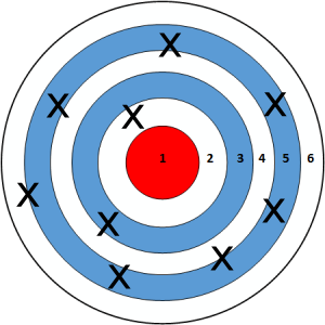
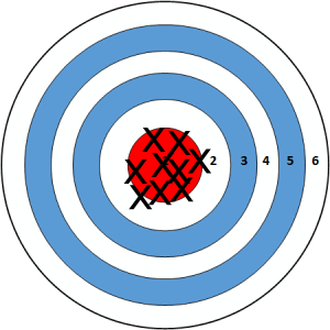
Smaller samples:

# Set up packages for lecture. Don't worry about understanding this code, but
# make sure to run it if you're following along.
import numpy as np
import babypandas as bpd
import pandas as pd
from matplotlib_inline.backend_inline import set_matplotlib_formats
import matplotlib.pyplot as plt
set_matplotlib_formats("svg")
plt.style.use('ggplot')

# Imports for animation.
from lec13 import sampling_animation
from IPython.display import display, IFrame, HTML, YouTubeVideo

np.set_printoptions(threshold=20, precision=2, suppress=True)
pd.set_option("display.max_rows", 7)
pd.set_option("display.max_columns", 8)
pd.set_option("display.precision", 2)
The distribution is uniform, meaning that each outcome has the same probability of occurring.
die_faces = np.arange(1, 7, 1)
die = bpd.DataFrame().assign(face=die_faces)
die
| face | |
|---|---|
| 0 | 1 |
| 1 | 2 |
| 2 | 3 |
| 3 | 4 |
| 4 | 5 |
| 5 | 6 |
bins = np.arange(0.5, 6.6, 1)

# Note that you can add titles to your visualizations, like this!
die.plot(kind='hist', y='face', bins=bins, density=True, ec='w',
         title='Probability Distribution of a Die Roll',
         figsize=(5, 3))

# You can also set the y-axis label with plt.ylabel
plt.ylabel('Probability');
np.random.choice.num_rolls = 25
many_rolls = np.random.choice(die_faces, num_rolls)
many_rolls
array([5, 5, 4, ..., 3, 5, 4])
(bpd.DataFrame()
 .assign(face=many_rolls)
 .plot(kind='hist', y='face', bins=bins, density=True, ec='w',
       title=f'Empirical Distribution of {num_rolls} Dice Rolls',
       figsize=(5, 3))
)
plt.ylabel('Probability');
for num_rolls in [10, 50, 100, 500, 1000, 5000, 10000]:
    # Don't worry about how .sample works just yet – we'll cover it shortly
    (die.sample(n=num_rolls, replace=True)
     .plot(kind='hist', y='face', bins=bins, density=True, ec='w',
           title=f'Distribution of {num_rolls} Die Rolls',
           figsize=(8, 3))
    )
The law of large numbers states that if a chance experiment is repeated
then the proportion of times that an event occurs gets closer and closer to the theoretical probability of that event.
For example: As you roll a die repeatedly, the proportion of times you roll a 5 gets closer to $\frac{1}{6}$.
Question: How do we collect a good sample, so that the sample distribution closely approximates the population distribution?
Bad idea ❌: Survey whoever you can get ahold of (e.g. internet survey, people in line at Panda Express at PC).
Good idea ✔️: Select individuals at random.
A simple random sample (SRS) is a sample drawn uniformly at random without replacement.
To perform an SRS from a list or array options, we use np.random.choice(options, n, replace=False).
tutors = ['Gabriel Cha', 'Eric Chen', 'Charlie Gillet', 'Vanessa Hu', 'Dylan Lee', 'Anthony Li',
          'Jasmine Lo', 'Linda Long', 'Aishani Mohapatra', 'Harshi Saha', 'Abel Seyoum',
          'Selim Shaalan', 'Yutian Shi', 'Tony Ta', 'Zairan Xiang', 'Diego Zavalza', 'Luran Zhang']

# Simple random sample of tutors
np.random.choice(tutors, 4, replace=False)
array(['Harshi Saha', 'Anthony Li', 'Diego Zavalza', 'Aishani Mohapatra'],
      dtype='<U17')
If we use replace=True, then we're sampling uniformly at random with replacement – there's no simpler term for this.
united_full contains information about all United flights leaving SFO between 6/1/15 and 8/31/15.
united_full = bpd.read_csv('data/united_summer2015.csv')
united_full
| Date | Flight Number | Destination | Delay | |
|---|---|---|---|---|
| 0 | 6/1/15 | 73 | HNL | 257 |
| 1 | 6/1/15 | 217 | EWR | 28 |
| 2 | 6/1/15 | 237 | STL | -3 |
| ... | ... | ... | ... | ... |
| 13822 | 8/31/15 | 1994 | ORD | 3 |
| 13823 | 8/31/15 | 2000 | PHX | -1 |
| 13824 | 8/31/15 | 2013 | EWR | -2 |
13825 rows × 4 columns
If we want to sample rows from a DataFrame, we can use the .sample method on a DataFrame. That is,
df.sample(n)
returns a random subset of n rows of df, drawn without replacement (i.e. the default is replace=False, unlike np.random.choice).
# 5 flights, chosen randomly without replacement
united_full.sample(5)
| Date | Flight Number | Destination | Delay | |
|---|---|---|---|---|
| 9564 | 8/3/15 | 1483 | IAD | -1 |
| 11739 | 8/17/15 | 1124 | SEA | -5 |
| 796 | 6/6/15 | 637 | JFK | 33 |
| 3887 | 6/26/15 | 1662 | BOS | 30 |
| 6859 | 7/16/15 | 1748 | AUS | 28 |
# 5 flights, chosen randomly with replacement
united_full.sample(5, replace=True)
| Date | Flight Number | Destination | Delay | |
|---|---|---|---|---|
| 13218 | 8/27/15 | 1655 | DEN | 1 |
| 6707 | 7/15/15 | 1916 | DEN | 8 |
| 4749 | 7/2/15 | 1453 | SEA | 18 |
| 124 | 6/1/15 | 1645 | IAD | 7 |
| 9077 | 7/31/15 | 693 | IAH | -7 |
Observe: The probability of a repetition in our sample is quite low, since our sample is small relative to the number of rows in the DataFrame.
We only need the 'Delay's, so let's select just that column.
united = united_full.get(['Delay'])
united
| Delay | |
|---|---|
| 0 | 257 |
| 1 | 28 |
| 2 | -3 |
| ... | ... |
| 13822 | 3 |
| 13823 | -1 |
| 13824 | -2 |
13825 rows × 1 columns
bins = np.arange(-20, 300, 10)
united.plot(kind='hist', y='Delay', bins=bins, density=True, ec='w',
            title='Population Distribution of Flight Delays', figsize=(8, 3))
plt.ylabel('Proportion per minute');
Note that this distribution is fixed – nothing about it is random.
united constitute our population.united without replacement.# Sample distribution
sample_size = 100
(united
.sample(sample_size)
.plot(kind='hist', y='Delay', bins=bins, density=True, ec='w',
title='Sample Distribution of Flight Delays',
figsize=(8, 3))
);
Note that as we increase sample_size, the sample distribution of delays looks more and more like the true population distribution of delays.
To remember: parameter and population both start with p, statistic and sample both start with s.
Question: What is the average delay of United flights out of SFO? 🤔
The population mean is a parameter.
# Calculate the mean of the population
united_mean = united.get('Delay').mean()
united_mean
16.658155515370705
This number (like the population distribution) is fixed, and is not random. In reality, we would not be able to see this number – we can only see it right now because this is a pedagogical demonstration!
The sample mean is a statistic. Since it depends on our sample, which was drawn at random, the sample mean is also random.
# Size 100
united.sample(100).get('Delay').mean()
13.04
What if we choose a larger sample size?
# Size 1000
united.sample(1000).get('Delay').mean()
17.833
Smaller samples:

Larger samples:

%%capture
anim, anim_means = sampling_animation(united, 1000);
HTML(anim.to_jshtml())
# Sample one thousand flights, two thousand times
sample_size = 1000
repetitions = 2000
sample_means = np.array([])

for n in np.arange(repetitions):
    m = united.sample(sample_size).get('Delay').mean()
    sample_means = np.append(sample_means, m)

bpd.DataFrame().assign(sample_means=sample_means) \
               .plot(kind='hist', bins=np.arange(10, 25, 0.5), density=True, ec='w',
                     title=f'Distribution of Sample Mean with Sample Size {sample_size}',
                     figsize=(10, 5));

plt.axvline(x=united_mean, c='black');
We just sampled one thousand flights, two thousand times. If we now sample one hundred flights, two thousand times, how will the histogram change?
After the midterm, we'll start talking about statistical models, which will lead us towards hypothesis testing.
Midterm is next class. Good luck!