            # Run this cell to set up packages for lecture.
from lec06_imports import *
Announcements
- Quiz 1 is today in Solis 104 during your assigned quiz session.
- Check your email for a seating assignment and refer to this map to know where to sit.
- 20 minute paper-based quiz with no aids allowed.
- The quiz covers Lectures 1 through 4, or BPD 1-9 in the
babypandasnotes.- Study by doing practice problems, especially those from this week's discussion and previous quizzes.
- Do as much as you can of Lab 1 (due tomorrow) and Homework 1 (due Sunday) before the quiz to develop fluency.
- You should know all of the functions and methods covered in lecture such as
abs,round,.upper()for strings, etc.
- See more quiz announcements on Ed.
Agenda
- Adjusting columns.
- Why visualize?
- Terminology.
- Scatter plots.
- Line plots.
- Bar charts.
Aside: Keyboard shortcuts
There are several keyboard shortcuts built into Jupyter Notebooks designed to help you save time. To see them, either click the keyboard button in the toolbar above or hit the H key on your keyboard (as long as you're not actively editing a cell).
Particularly useful shortcuts:
| Action | Keyboard shortcut |
|---|---|
| Run cell + jump to next cell | SHIFT + ENTER |
| Save the notebook | CTRL/CMD + S |
| Create new cell above/below | A/B |
| Delete cell | DD |
Adjusting columns
.count()
As before, we'll work with the states DataFrame. Notice the column names don't make sense after grouping with the .count() aggregation method.
states = bpd.read_csv('data/states.csv')
states = states.assign(Density=states.get('Population') / states.get('Land Area'))
states = states.set_index('State')
states
| Region | Capital City | Population | Land Area | Party | Density | |
|---|---|---|---|---|---|---|
| State | ||||||
| Alabama | South | Montgomery | 5024279 | 50645 | Republican | 99.21 |
| Alaska | West | Juneau | 733391 | 570641 | Republican | 1.29 |
| Arizona | West | Phoenix | 7151502 | 113594 | Republican | 62.96 |
| ... | ... | ... | ... | ... | ... | ... |
| West Virginia | South | Charleston | 1793716 | 24038 | Republican | 74.62 |
| Wisconsin | Midwest | Madison | 5893718 | 54158 | Republican | 108.82 |
| Wyoming | West | Cheyenne | 576851 | 97093 | Republican | 5.94 |
50 rows × 6 columns
states.groupby('Region').count()
| Capital City | Population | Land Area | Party | Density | |
|---|---|---|---|---|---|
| Region | |||||
| Midwest | 12 | 12 | 12 | 12 | 12 |
| Northeast | 9 | 9 | 9 | 9 | 9 |
| South | 16 | 16 | 16 | 16 | 16 |
| West | 13 | 13 | 13 | 13 | 13 |
Adjusting columns with .assign, .drop, and .get
- To rename a column, use
.assignto create a new column containing the same values as an existing column.- New columns are added on the right.
- Then use
.drop(columns=list_of_column_labels)to drop any columns you no longer need.- Alternatively, use
.get(list_of_column_labels)to keep only certain columns. The columns will appear in the order you specify, so this is also useful for reordering columns!
- Alternatively, use
Two ways to .get
- Getting a single column name gives a Series.
- Getting a
listof column names gives a DataFrame. (Even if the list has just one element!)
states.get('Capital City')
State
Alabama          Montgomery
Alaska               Juneau
Arizona             Phoenix
                    ...
West Virginia    Charleston
Wisconsin           Madison
Wyoming            Cheyenne
Name: Capital City, Length: 50, dtype: object
states.get(['Capital City', 'Party'])
| Capital City | Party | |
|---|---|---|
| State | ||
| Alabama | Montgomery | Republican |
| Alaska | Juneau | Republican |
| Arizona | Phoenix | Republican |
| ... | ... | ... |
| West Virginia | Charleston | Republican |
| Wisconsin | Madison | Republican |
| Wyoming | Cheyenne | Republican |
50 rows × 2 columns
states.get(['Capital City'])
| Capital City | |
|---|---|
| State | |
| Alabama | Montgomery |
| Alaska | Juneau |
| Arizona | Phoenix |
| ... | ... |
| West Virginia | Charleston |
| Wisconsin | Madison |
| Wyoming | Cheyenne |
50 rows × 1 columns
Activity
Change the DataFrame states_by_region so that it only has one column, called Count, containing the number of states in each region.
states_by_region = states.groupby('Region').count()
states_by_region
| Capital City | Population | Land Area | Party | Density | |
|---|---|---|---|---|---|
| Region | |||||
| Midwest | 12 | 12 | 12 | 12 | 12 |
| Northeast | 9 | 9 | 9 | 9 | 9 |
| South | 16 | 16 | 16 | 16 | 16 |
| West | 13 | 13 | 13 | 13 | 13 |
Why visualize?
Little Women
In Lecture 1, we were able to answer questions about the plot of Little Women without having to read the novel and without having to understand Python code. Some of those questions included:
- Who is the main character?
- Which pair of characters gets married in Chapter 35?
We answered these questions from a data visualization alone!
bpd.read_csv('data/lw_counts.csv').plot(x='Chapter');

Why visualize?
- Computers are better than humans at crunching numbers, but humans are better at identifying visual patterns.
- Visualizations allow us to understand lots of data quickly – they make it easier to spot trends and communicate our results with others.
- There are many types of visualizations; in this class, we'll look at scatter plots, line plots, bar charts, and histograms, but there are many others.
- The right choice depends on the type of data.
Terminology
Individuals and variables
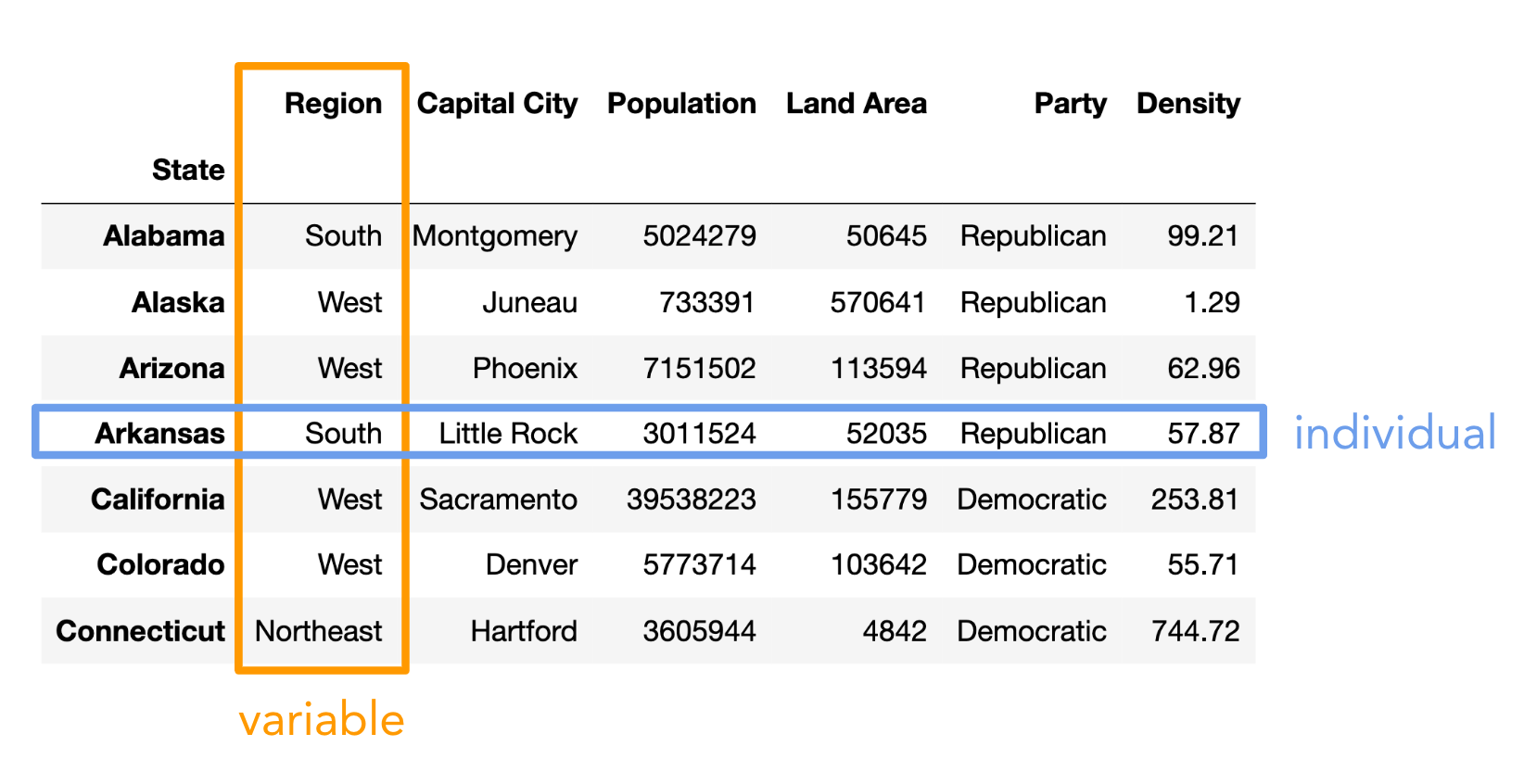
- Individual (row): Person/place/thing for which data is recorded. Also called an observation.
- Variable (column): Something that is recorded for each individual. Also called a feature.
Types of variables
There are two main types of variables:
- Numerical: It makes sense to do arithmetic with the values.
- Categorical: Values fall into categories, that may or may not have some order to them.
Note that here, "variable" does not mean a variable in Python, but rather it means a column in a DataFrame.
Examples of numerical variables
- Salaries of NBA players 🏀.
- Individual: An NBA player.
- Variable: Their salary.
- Company's annual profit 💰.
- Individual: A company.
- Variable: Its annual profit.
- Flu shots administered per day 💉.
- Individual: Date.
- Variable: Number of flu shots administered on that date.
Examples of categorical variables
- Movie genres 🎬.
- Individual: A movie.
- Variable: Its genre.
- Zip codes 🏠.
- Individual: US resident.
- Variable: Zip code.
- Even though they look like numbers, zip codes are categorical (arithmetic doesn't make sense).
- Level of prior programming experience for students in DSC 10 🧑🎓.
- Individual: Student in DSC 10.
- Variable: Their level of prior programming experience, e.g. none, low, medium, or high.
- There is an order to these categories!
Concept Check ✅ – Answer at cc.dsc10.com
Which of these is not a numerical variable?
A. Fuel economy in miles per gallon.
B. Number of quarters at UCSD.
C. College at UCSD (Sixth, Seventh, etc).
D. Bank account number.
E. More than one of these are not numerical variables.
Types of visualizations
The type of visualization we create depends on the kinds of variables we're visualizing.
- Scatter plot: Numerical vs. numerical.
- Line plot: Sequential numerical (time) vs. numerical.
- Bar chart: Categorical vs. numerical.
- Histogram: Numerical.
- Will cover next time.
We may interchange the words "plot", "chart", and "graph"; they all mean the same thing.
Scatter plots
The data: exoplanets discovered by NASA 🪐
An exoplanet is a planet outside our solar system. NASA has discovered over 5,000 exoplanets so far in its search for signs of life beyond Earth. 👽
| Column | Contents |
|---|---|
'Distance'| Distance from Earth, in light years.
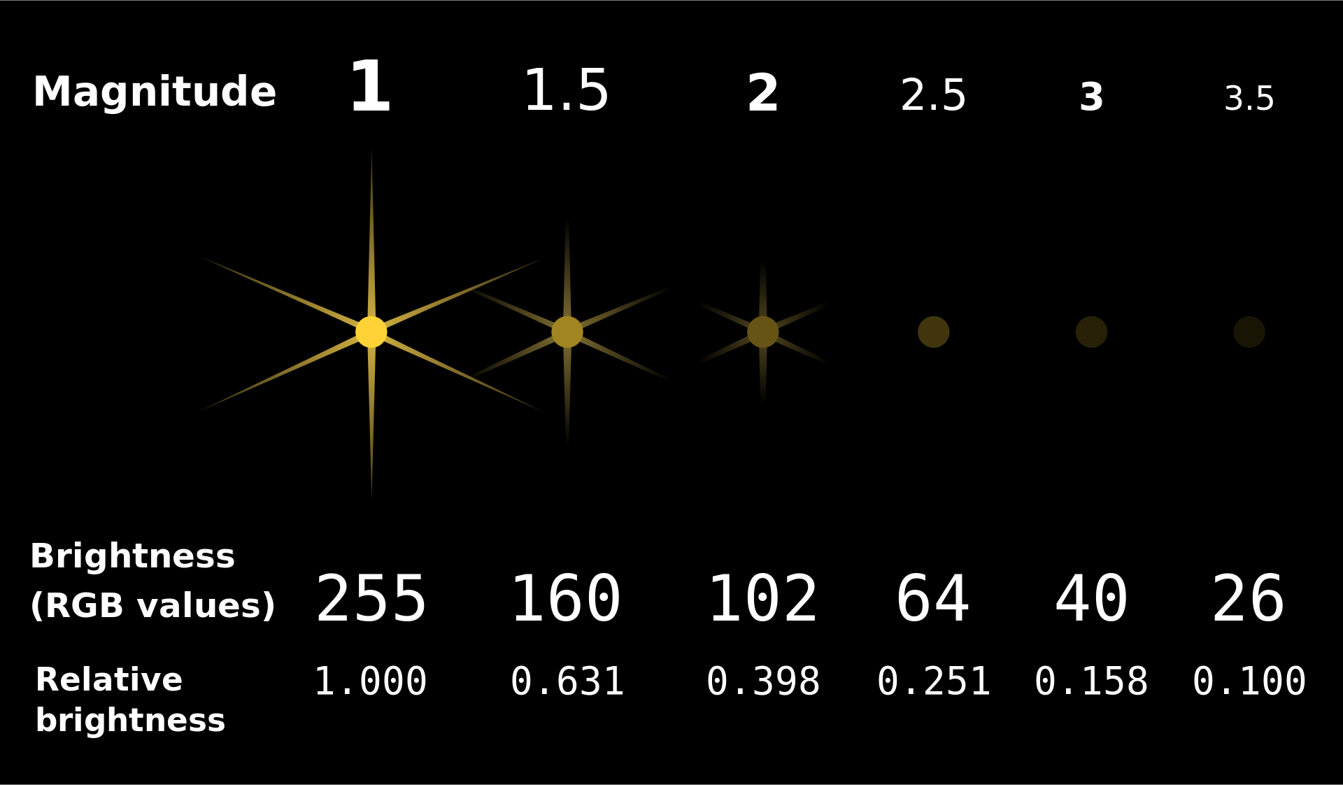
'Magnitude'| Apparent magnitude, which measures brightness in such a way that brighter objects have lower values.
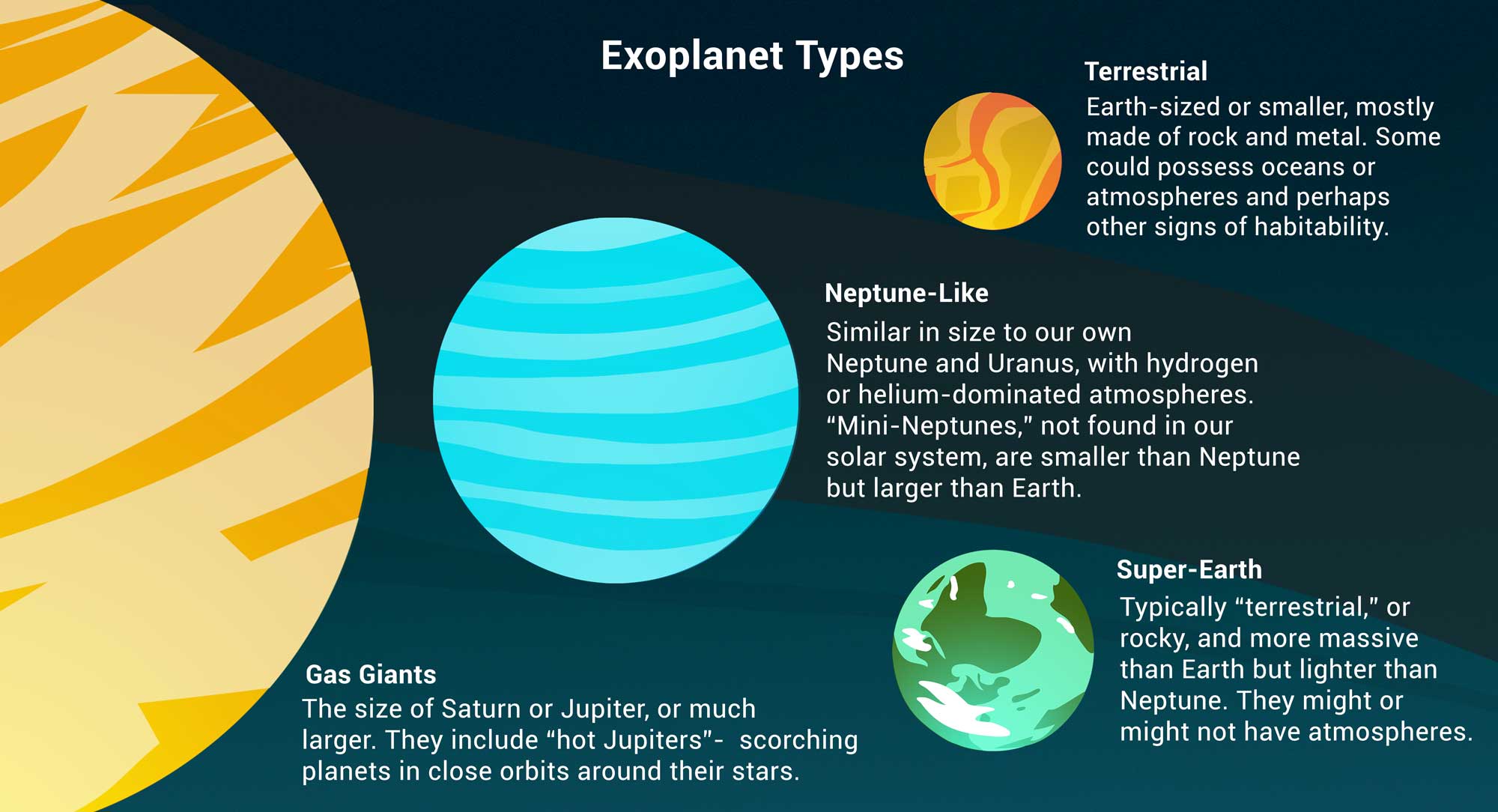
'Type'| Categorization of planet based on its composition and size.
'Year'| When the planet was discovered.
'Detection'| The method of detection used to discover the planet.
'Mass'| The ratio of the planet's mass to Earth's mass.
'Radius'| The ratio of the planet's radius to Earth's radius.
exo = bpd.read_csv('data/exoplanets.csv').set_index('Name')
exo
| Distance | Magnitude | Type | Year | Detection | Mass | Radius | |
|---|---|---|---|---|---|---|---|
| Name | |||||||
| 11 Comae Berenices b | 304.0 | 4.72 | Gas Giant | 2007 | Radial Velocity | 6165.90 | 11.88 |
| 11 Ursae Minoris b | 409.0 | 5.01 | Gas Giant | 2009 | Radial Velocity | 4684.81 | 11.99 |
| 14 Andromedae b | 246.0 | 5.23 | Gas Giant | 2008 | Radial Velocity | 1525.58 | 12.65 |
| ... | ... | ... | ... | ... | ... | ... | ... |
| YZ Ceti b | 12.0 | 12.07 | Terrestrial | 2017 | Radial Velocity | 0.70 | 0.91 |
| YZ Ceti c | 12.0 | 12.07 | Super Earth | 2017 | Radial Velocity | 1.14 | 1.05 |
| YZ Ceti d | 12.0 | 12.07 | Super Earth | 2017 | Radial Velocity | 1.09 | 1.03 |
5043 rows × 7 columns
Scatter plots
- What is the relationship between
'Distance'and'Magnitude'?
exo.plot(kind='scatter', x='Distance', y='Magnitude');

Further planets have greater
'Magnitude'(meaning they are less bright), which makes sense.The data appears curved because
'Magnitude'is measured on a logarithmic scale. A decrease of one unit in'Magnitude'corresponds to a 2.5 times increase in brightness.
Scatter plots
- Scatter plots visualize the relationship between two numerical variables.
- To create one from a DataFrame
df, use
df.plot(
    kind='scatter',
    x=x_column_for_horizontal,
    y=y_column_for_vertical
)
- The resulting scatter plot has one point per row of
df. - If you put a semicolon after a call to
.plot, it will hide the weird text output that displays.
Zooming in 🔍
The majority of exoplanets are less than 10,000 light years away; if we'd like to zoom in on just these exoplanets, we can query before plotting.
exo[exo.get('Distance') < 10000].plot(kind='scatter', x='Distance', y='Magnitude');

Line plots 📉
Line plots
- How has the
'Magnitude'of newly discovered exoplanets changed over time?
# There were multiple exoplanets discovered each year.
# What operation can we apply to this DataFrame so that there is one row per year?
exo
| Distance | Magnitude | Type | Year | Detection | Mass | Radius | |
|---|---|---|---|---|---|---|---|
| Name | |||||||
| 11 Comae Berenices b | 304.0 | 4.72 | Gas Giant | 2007 | Radial Velocity | 6165.90 | 11.88 |
| 11 Ursae Minoris b | 409.0 | 5.01 | Gas Giant | 2009 | Radial Velocity | 4684.81 | 11.99 |
| 14 Andromedae b | 246.0 | 5.23 | Gas Giant | 2008 | Radial Velocity | 1525.58 | 12.65 |
| ... | ... | ... | ... | ... | ... | ... | ... |
| YZ Ceti b | 12.0 | 12.07 | Terrestrial | 2017 | Radial Velocity | 0.70 | 0.91 |
| YZ Ceti c | 12.0 | 12.07 | Super Earth | 2017 | Radial Velocity | 1.14 | 1.05 |
| YZ Ceti d | 12.0 | 12.07 | Super Earth | 2017 | Radial Velocity | 1.09 | 1.03 |
5043 rows × 7 columns
- Let's calculate the average
'Magnitude'of all exoplanets discovered in each'Year'.
exo.groupby('Year').mean()
| Distance | Magnitude | Mass | Radius | |
|---|---|---|---|---|
| Year | ||||
| 1995 | 50.00 | 5.45 | 146.20 | 13.97 |
| 1996 | 51.33 | 5.12 | 1020.67 | 13.09 |
| 1997 | 57.00 | 5.41 | 332.10 | 13.53 |
| ... | ... | ... | ... | ... |
| 2021 | 1944.22 | 13.01 | 255.42 | 4.44 |
| 2022 | 508.61 | 10.62 | 943.16 | 6.77 |
| 2023 | 451.89 | 12.09 | 162.78 | 7.12 |
29 rows × 4 columns
exo.groupby('Year').mean().plot(kind='line', y='Magnitude');

It looks like the brightest planets were discovered first, which makes sense.
NASA's Kepler space telescope began its nine-year mission in 2009, leading to a boom in the discovery of exoplanets.
Line plots
- Line plots show trends in numerical variables over time.
- To create one from a DataFrame
df, use
df.plot(
    kind='line',
    x=x_column_for_horizontal,
    y=y_column_for_vertical
)
- To use the index as the x-axis, omit the
x=argument.- This doesn't work for scatterplots, but it works for most other plot types.
Extra video on line plots
If you're curious how line plots work under the hood, watch this video we made a few quarters ago.
YouTubeVideo('glzZ04D1kDg')
Bar charts 📊
Bar charts
- How big are each of the different
'Type's of exoplanets, on average?
types = exo.groupby('Type').mean()
types
| Distance | Magnitude | Year | Mass | Radius | |
|---|---|---|---|---|---|
| Type | |||||
| Gas Giant | 1096.40 | 10.30 | 2013.73 | 1472.39 | 12.74 |
| Neptune-like | 2189.02 | 13.52 | 2016.59 | 15.28 | 3.11 |
| Super Earth | 1916.26 | 13.85 | 2016.43 | 5.81 | 1.58 |
| Terrestrial | 1373.60 | 13.45 | 2016.37 | 1.62 | 0.85 |
types.plot(kind='barh', y='Radius');

types.plot(kind='barh', y='Mass');

- It looks like the
'Gas Giant's are aptly named!
Bar charts
- Bar charts visualize the relationship between a categorical variable and a numerical variable.
- In a bar chart...
- The thickness and spacing of bars is arbitrary.
- The order of the categorical labels doesn't matter.
- To create one from a DataFrame
df, use
df.plot(
    kind='barh',
    x=categorical_column_name,
    y=numerical_column_name
)
- The "h" in
'barh'stands for "horizontal".- It's easier to read labels this way.
- Note that in the previous chart, we set
y='Mass'even though mass is measured by x-axis length.
Bar charts and sorting
What are the most popular 'Detection' methods for discovering exoplanets?
# Count how many exoplanets are discovered by each detection method.
popular_detection = exo.groupby('Detection').count()
popular_detection
| Distance | Magnitude | Type | Year | Mass | Radius | |
|---|---|---|---|---|---|---|
| Detection | ||||||
| Astrometry | 1 | 1 | 1 | 1 | 1 | 1 |
| Direct Imaging | 50 | 50 | 50 | 50 | 50 | 50 |
| Disk Kinematics | 1 | 1 | 1 | 1 | 1 | 1 |
| ... | ... | ... | ... | ... | ... | ... |
| Radial Velocity | 1019 | 1019 | 1019 | 1019 | 1019 | 1019 |
| Transit | 3914 | 3914 | 3914 | 3914 | 3914 | 3914 |
| Transit Timing Variations | 23 | 23 | 23 | 23 | 23 | 23 |
11 rows × 6 columns
# Give columns more meaningful names and eliminate redundancy.
popular_detection = (popular_detection.assign(Count=popular_detection.get('Distance'))
                                      .get(['Count'])
                                      .sort_values(by='Count', ascending=False)
                    )
popular_detection
| Count | |
|---|---|
| Detection | |
| Transit | 3914 |
| Radial Velocity | 1019 |
| Direct Imaging | 50 |
| ... | ... |
| Astrometry | 1 |
| Disk Kinematics | 1 |
| Pulsar Timing | 1 |
11 rows × 1 columns
# Notice that the bars appear in the opposite order relative to the DataFrame.
popular_detection.plot(kind='barh', y='Count');

# Change "barh" to "bar" to get a vertical bar chart.
# These are harder to read, but the bars do appear in the same order as the DataFrame.
popular_detection.plot(kind='bar', y='Count');

Multiple plots on the same axes
Can we look at both the average 'Magnitude' and the average 'Radius' for each 'Type' at the same time?
types.get(['Magnitude', 'Radius']).plot(kind='barh');

How did we do that?
Overlaying plots
When calling .plot, if we omit the y=column_name argument, all other columns are plotted.
types
| Distance | Magnitude | Year | Mass | Radius | |
|---|---|---|---|---|---|
| Type | |||||
| Gas Giant | 1096.40 | 10.30 | 2013.73 | 1472.39 | 12.74 |
| Neptune-like | 2189.02 | 13.52 | 2016.59 | 15.28 | 3.11 |
| Super Earth | 1916.26 | 13.85 | 2016.43 | 5.81 | 1.58 |
| Terrestrial | 1373.60 | 13.45 | 2016.37 | 1.62 | 0.85 |
types.plot(kind='barh');

Selecting multiple columns at once
Remember, to select multiple columns, use .get([column_1, ..., column_k]). This returns a DataFrame.
types
| Distance | Magnitude | Year | Mass | Radius | |
|---|---|---|---|---|---|
| Type | |||||
| Gas Giant | 1096.40 | 10.30 | 2013.73 | 1472.39 | 12.74 |
| Neptune-like | 2189.02 | 13.52 | 2016.59 | 15.28 | 3.11 |
| Super Earth | 1916.26 | 13.85 | 2016.43 | 5.81 | 1.58 |
| Terrestrial | 1373.60 | 13.45 | 2016.37 | 1.62 | 0.85 |
types.get(['Magnitude', 'Radius'])
| Magnitude | Radius | |
|---|---|---|
| Type | ||
| Gas Giant | 10.30 | 12.74 |
| Neptune-like | 13.52 | 3.11 |
| Super Earth | 13.85 | 1.58 |
| Terrestrial | 13.45 | 0.85 |
types.get(['Magnitude', 'Radius']).plot(kind='barh');
Summary
Summary
- Visualizations make it easy to extract patterns from datasets.
- There are two main types of variables: categorical and numerical.
- The types of the variables we're visualizing inform our choice of which type of visualization to use.
- Today, we looked at scatter plots, line plots, and bar charts.
- Next time: histograms.