In [17]:
bpd.read_csv('data/lw_counts.csv').plot(x='Chapter');

# Run this cell to set up packages for lecture.
from lec06_imports import *
There are several keyboard shortcuts built into Jupyter Notebooks designed to help you save time. To see them, either click the keyboard button in the toolbar above or hit the H key on your keyboard (as long as you're not actively editing a cell).
Particularly useful shortcuts:
| Action | Keyboard shortcut |
|---|---|
| Run cell + jump to next cell | SHIFT + ENTER |
| Save the notebook | CTRL/CMD + S |
| Create new cell above/below | A/B |
| Delete cell | DD |
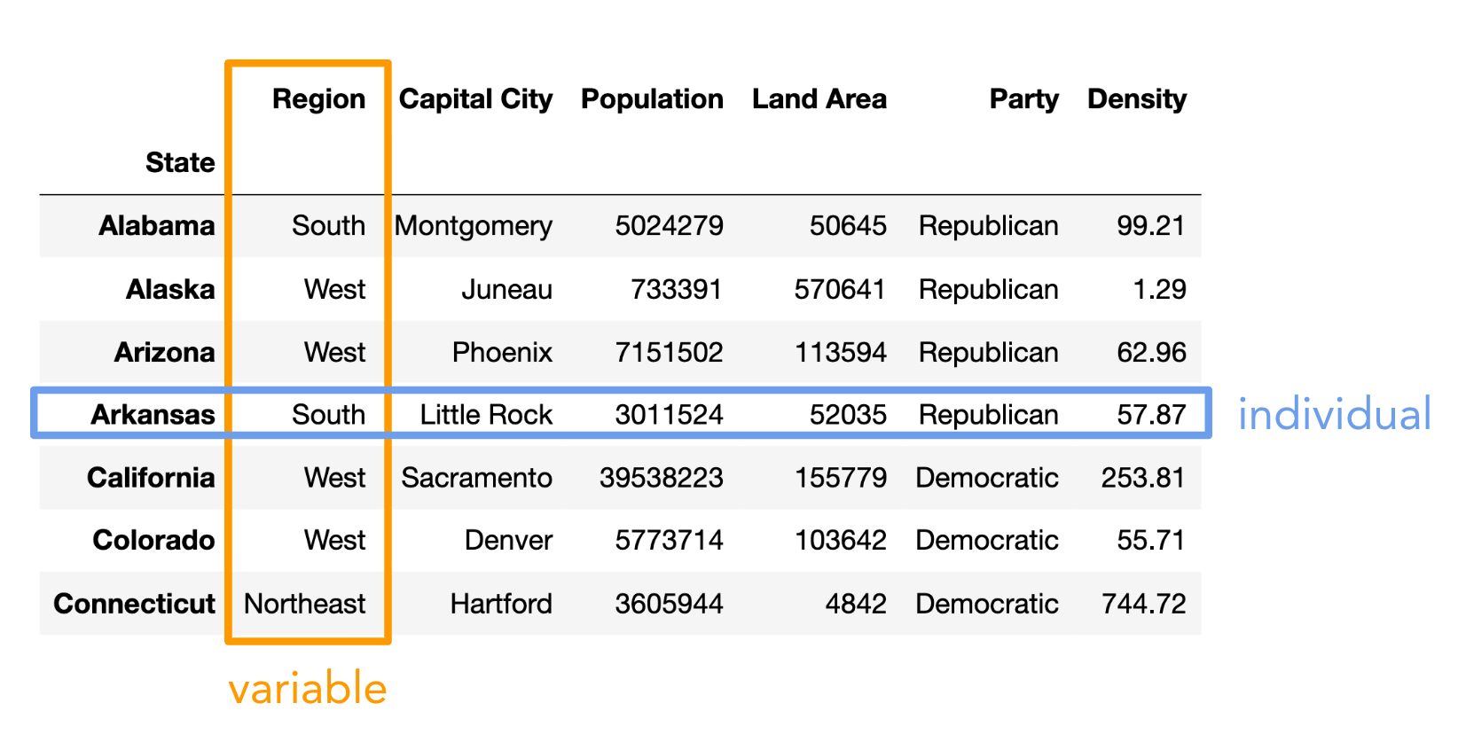
states = bpd.read_csv('data/states.csv').set_index('State')
states = states.assign(Density=states.get('Population') / states.get('Land Area'))
states
| Region | Capital City | Population | Land Area | Party | Density | |
|---|---|---|---|---|---|---|
| State | ||||||
| Alabama | South | Montgomery | 5024279 | 50645 | Republican | 99.21 |
| Alaska | West | Juneau | 733391 | 570641 | Republican | 1.29 |
| Arizona | West | Phoenix | 7151502 | 113594 | Republican | 62.96 |
| ... | ... | ... | ... | ... | ... | ... |
| West Virginia | South | Charleston | 1793716 | 24038 | Republican | 74.62 |
| Wisconsin | Midwest | Madison | 5893718 | 54158 | Republican | 108.82 |
| Wyoming | West | Cheyenne | 576851 | 97093 | Republican | 5.94 |
50 rows × 6 columns
We can find the total population of any one region using the tools we already have.
states[states.get('Region') == 'West'].get('Population').sum()
78588572
states[states.get('Region') == 'Midwest'].get('Population').sum()
68985454
But can we find the total population of every region all at the same time, without writing very similar code multiple times? Yes, there is a better way!
.groupby¶Observe what happens when we use the .groupby method on states with the argument 'Region'.
states.groupby('Region').sum()
| Population | Land Area | Density | |
|---|---|---|---|
| Region | |||
| Midwest | 68985454 | 750524 | 1298.78 |
| Northeast | 57609148 | 161912 | 4957.49 |
| South | 125576562 | 868356 | 3189.37 |
| West | 78588572 | 1751054 | 881.62 |
These populations (for the 'West' and 'Midwest') match the ones we found on the previous slide, except now we get the populations for all regions at the same time. What just happened? 🤯
Consider the DataFrame pets, shown below.
| Species | Color | Weight | Age | |
|---|---|---|---|---|
| 0 | dog | black | 40 | 5.0 |
| 1 | cat | golden | 15 | 8.0 |
| 2 | cat | black | 20 | 9.0 |
| 3 | dog | white | 80 | 2.0 |
| 4 | dog | golden | 25 | 0.5 |
| 5 | hamster | golden | 1 | 3.0 |
Let's see what happens under the hood when we run pets.groupby('Species').mean().
show_grouping_animation()
pets = bpd.DataFrame().assign(
    Species=['dog', 'cat', 'cat', 'dog', 'dog', 'hamster'],
    Color=['black', 'golden', 'black', 'white', 'golden', 'golden'],
    Weight=[40, 15, 20, 80, 25, 1],
    Age=[5, 8, 9, 2, 0.5, 3]
)
pets
| Species | Color | Weight | Age | |
|---|---|---|---|---|
| 0 | dog | black | 40 | 5.0 |
| 1 | cat | golden | 15 | 8.0 |
| 2 | cat | black | 20 | 9.0 |
| 3 | dog | white | 80 | 2.0 |
| 4 | dog | golden | 25 | 0.5 |
| 5 | hamster | golden | 1 | 3.0 |
pets.groupby('Species').mean()
| Weight | Age | |
|---|---|---|
| Species | ||
| cat | 17.50 | 8.5 |
| dog | 48.33 | 2.5 |
| hamster | 1.00 | 3.0 |
It takes several steps to go from the original pets DataFrame to this grouped DataFrame, but we don't get to see any of Python's inner workings, just the final output.
states.groupby('Region').sum()
| Population | Land Area | Density | |
|---|---|---|---|
| Region | |||
| Midwest | 68985454 | 750524 | 1298.78 |
| Northeast | 57609148 | 161912 | 4957.49 |
| South | 125576562 | 868356 | 3189.37 |
| West | 78588572 | 1751054 | 881.62 |
# Note the use of .index – remember, the index isn't a column!
(
    states
    .groupby('Region')
    .sum()
    .sort_values(by='Population', ascending=False)
    .index[0]
)
'South'
.groupby in general¶In short, .groupby aggregates (collects) all rows with the same value in a specified column (e.g. 'Region') into a single row in the resulting DataFrame, using an aggregation method (e.g. .sum()) to combine values from different rows with the same value in the specified column.
To use .groupby:
.groupby(column_name) will gather rows which have the same value in the specified column (column_name)..count(), .sum(), .mean(), .median(), .max(), and .min().states
| Region | Capital City | Population | Land Area | Party | Density | |
|---|---|---|---|---|---|---|
| State | ||||||
| Alabama | South | Montgomery | 5024279 | 50645 | Republican | 99.21 |
| Alaska | West | Juneau | 733391 | 570641 | Republican | 1.29 |
| Arizona | West | Phoenix | 7151502 | 113594 | Republican | 62.96 |
| ... | ... | ... | ... | ... | ... | ... |
| West Virginia | South | Charleston | 1793716 | 24038 | Republican | 74.62 |
| Wisconsin | Midwest | Madison | 5893718 | 54158 | Republican | 108.82 |
| Wyoming | West | Cheyenne | 576851 | 97093 | Republican | 5.94 |
50 rows × 6 columns
states.groupby('Region').sum()
| Population | Land Area | Density | |
|---|---|---|---|
| Region | |||
| Midwest | 68985454 | 750524 | 1298.78 |
| Northeast | 57609148 | 161912 | 4957.49 |
| South | 125576562 | 868356 | 3189.37 |
| West | 78588572 | 1751054 | 881.62 |
states.groupby('Region').max()
| Capital City | Population | Land Area | Party | Density | |
|---|---|---|---|---|---|
| Region | |||||
| Midwest | Topeka | 12812508 | 81759 | Republican | 288.77 |
| Northeast | Trenton | 20201249 | 47126 | Republican | 1263.12 |
| South | Tallahassee | 29145505 | 261232 | Republican | 636.37 |
| West | Santa Fe | 39538223 | 570641 | Republican | 253.81 |
12812508 / 81759 == 288.77
False
.count() aggregation method.states.groupby('Region').count()
| Capital City | Population | Land Area | Party | Density | |
|---|---|---|---|---|---|
| Region | |||||
| Midwest | 12 | 12 | 12 | 12 | 12 |
| Northeast | 9 | 9 | 9 | 9 | 9 |
| South | 16 | 16 | 16 | 16 | 16 |
| West | 13 | 13 | 13 | 13 | 13 |
Consider dropping unneeded columns and renaming columns as follows:
.assign to create a new column containing the same values as the old column(s)..drop(columns=list_of_column_labels) to drop the old column(s). .get(list_of_column_labels) to keep only the columns in the given list. The columns will appear in the order you specify, so this is also useful for reordering columns!states_by_region = states.groupby('Region').count()
states_by_region = states_by_region.assign(
States=states_by_region.get('Capital City')
).get(['States'])
states_by_region
| States | |
|---|---|
| Region | |
| Midwest | 12 |
| Northeast | 9 |
| South | 16 |
| West | 13 |
In Lecture 1, we were able to answer questions about the plot of Little Women without having to read the novel and without having to understand Python code. Some of those questions included:
We answered these questions from a data visualization alone!
bpd.read_csv('data/lw_counts.csv').plot(x='Chapter');
There are two main types of variables:
Note that here, "variable" does not mean a variable in Python, but rather it means a column in a DataFrame.
Which of these is not a numerical variable?
A. Fuel economy in miles per gallon.
B. Number of quarters at UCSD.
C. College at UCSD (Sixth, Seventh, etc).
D. Bank account number.
E. More than one of these are not numerical variables.
The type of visualization we create depends on the kinds of variables we're visualizing.
We may interchange the words "plot", "chart", and "graph"; they all mean the same thing.
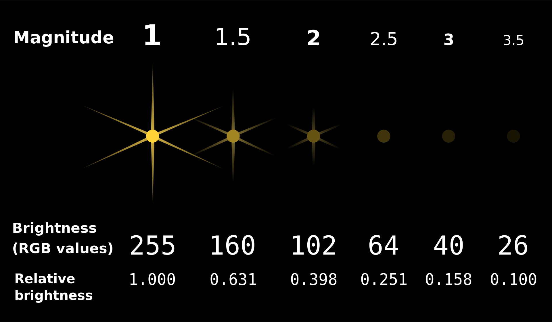
An exoplanet is a planet outside our solar system. NASA has discovered over 5,000 exoplanets so far in its search for signs of life beyond Earth. 👽
| Column | Contents |
|---|---|
'Distance'| Distance from Earth, in light years.
'Magnitude'| Apparent magnitude, which measures brightness in such a way that brighter objects have lower values.
'Type'| Categorization of planet based on its composition and size.
'Year'| When the planet was discovered.
'Detection'| The method of detection used to discover the planet.
'Mass'| The ratio of the planet's mass to Earth's mass.
'Radius'| The ratio of the planet's radius to Earth's radius.
exo = bpd.read_csv('data/exoplanets.csv').set_index('Name')
exo
| Distance | Magnitude | Type | Year | Detection | Mass | Radius | |
|---|---|---|---|---|---|---|---|
| Name | |||||||
| 11 Comae Berenices b | 304.0 | 4.72 | Gas Giant | 2007 | Radial Velocity | 6165.90 | 11.88 |
| 11 Ursae Minoris b | 409.0 | 5.01 | Gas Giant | 2009 | Radial Velocity | 4684.81 | 11.99 |
| 14 Andromedae b | 246.0 | 5.23 | Gas Giant | 2008 | Radial Velocity | 1525.58 | 12.65 |
| ... | ... | ... | ... | ... | ... | ... | ... |
| YZ Ceti b | 12.0 | 12.07 | Terrestrial | 2017 | Radial Velocity | 0.70 | 0.91 |
| YZ Ceti c | 12.0 | 12.07 | Super Earth | 2017 | Radial Velocity | 1.14 | 1.05 |
| YZ Ceti d | 12.0 | 12.07 | Super Earth | 2017 | Radial Velocity | 1.09 | 1.03 |
5043 rows × 7 columns
'Distance' and 'Magnitude'?exo.plot(kind='scatter', x='Distance', y='Magnitude');

Further planets have greater 'Magnitude' (meaning they are less bright), which makes sense.
The data appears curved because 'Magnitude' is measured on a logarithmic scale. A decrease of one unit in 'Magnitude' corresponds to a 2.5 times increase in brightness.
df, usedf.plot(
kind='scatter',
x=x_column_for_horizontal,
y=y_column_for_vertical
)
df..plot, it will hide the weird text output that displays.The majority of exoplanets are less than 10,000 light years away; if we'd like to zoom in on just these exoplanets, we can query before plotting.
exo[exo.get('Distance') < 10000].plot(kind='scatter', x='Distance', y='Magnitude');

'Magnitude' of newly discovered exoplanets changed over time?# There were multiple exoplanets discovered each year.
# What operation can we apply to this DataFrame so that there is one row per year?
exo
| Distance | Magnitude | Type | Year | Detection | Mass | Radius | |
|---|---|---|---|---|---|---|---|
| Name | |||||||
| 11 Comae Berenices b | 304.0 | 4.72 | Gas Giant | 2007 | Radial Velocity | 6165.90 | 11.88 |
| 11 Ursae Minoris b | 409.0 | 5.01 | Gas Giant | 2009 | Radial Velocity | 4684.81 | 11.99 |
| 14 Andromedae b | 246.0 | 5.23 | Gas Giant | 2008 | Radial Velocity | 1525.58 | 12.65 |
| ... | ... | ... | ... | ... | ... | ... | ... |
| YZ Ceti b | 12.0 | 12.07 | Terrestrial | 2017 | Radial Velocity | 0.70 | 0.91 |
| YZ Ceti c | 12.0 | 12.07 | Super Earth | 2017 | Radial Velocity | 1.14 | 1.05 |
| YZ Ceti d | 12.0 | 12.07 | Super Earth | 2017 | Radial Velocity | 1.09 | 1.03 |
5043 rows × 7 columns
'Magnitude' of all exoplanets discovered in each 'Year'.exo.groupby('Year').mean()
| Distance | Magnitude | Mass | Radius | |
|---|---|---|---|---|
| Year | ||||
| 1995 | 50.00 | 5.45 | 146.20 | 13.97 |
| 1996 | 51.33 | 5.12 | 1020.67 | 13.09 |
| 1997 | 57.00 | 5.41 | 332.10 | 13.53 |
| ... | ... | ... | ... | ... |
| 2021 | 1944.22 | 13.01 | 255.42 | 4.44 |
| 2022 | 508.61 | 10.62 | 943.16 | 6.77 |
| 2023 | 451.89 | 12.09 | 162.78 | 7.12 |
29 rows × 4 columns
exo.groupby('Year').mean().plot(kind='line', y='Magnitude');

It looks like the brightest planets were discovered first, which makes sense.
NASA's Kepler space telescope began its nine-year mission in 2009, leading to a boom in the discovery of exoplanets.
df, usedf.plot(
kind='line',
x=x_column_for_horizontal,
y=y_column_for_vertical
)
x= argument.If you're curious how line plots work under the hood, watch this video we made a few quarters ago.
YouTubeVideo('glzZ04D1kDg')
'Type's of exoplanets, on average?types = exo.groupby('Type').mean()
types
| Distance | Magnitude | Year | Mass | Radius | |
|---|---|---|---|---|---|
| Type | |||||
| Gas Giant | 1096.40 | 10.30 | 2013.73 | 1472.39 | 12.74 |
| Neptune-like | 2189.02 | 13.52 | 2016.59 | 15.28 | 3.11 |
| Super Earth | 1916.26 | 13.85 | 2016.43 | 5.81 | 1.58 |
| Terrestrial | 1373.60 | 13.45 | 2016.37 | 1.62 | 0.85 |
types.plot(kind='barh', y='Radius');

types.plot(kind='barh', y='Mass');

'Gas Giant's are aptly named! 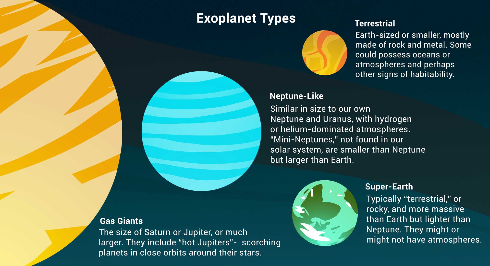
df, usedf.plot(
kind='barh',
x=categorical_column_name,
y=numerical_column_name
)
'barh' stands for "horizontal".y='Mass' even though mass is measured by x-axis length.What are the most popular 'Detection' methods for discovering exoplanets?
# Count how many exoplanets are discovered by each detection method.
popular_detection = exo.groupby('Detection').count()
popular_detection
| Distance | Magnitude | Type | Year | Mass | Radius | |
|---|---|---|---|---|---|---|
| Detection | ||||||
| Astrometry | 1 | 1 | 1 | 1 | 1 | 1 |
| Direct Imaging | 50 | 50 | 50 | 50 | 50 | 50 |
| Disk Kinematics | 1 | 1 | 1 | 1 | 1 | 1 |
| ... | ... | ... | ... | ... | ... | ... |
| Radial Velocity | 1019 | 1019 | 1019 | 1019 | 1019 | 1019 |
| Transit | 3914 | 3914 | 3914 | 3914 | 3914 | 3914 |
| Transit Timing Variations | 23 | 23 | 23 | 23 | 23 | 23 |
11 rows × 6 columns
# Give columns more meaningful names and eliminate redundancy.
popular_detection = (popular_detection.assign(Count=popular_detection.get('Distance'))
                                      .get(['Count'])
                                      .sort_values(by='Count', ascending=False)
                    )
popular_detection
| Count | |
|---|---|
| Detection | |
| Transit | 3914 |
| Radial Velocity | 1019 |
| Direct Imaging | 50 |
| ... | ... |
| Astrometry | 1 |
| Disk Kinematics | 1 |
| Pulsar Timing | 1 |
11 rows × 1 columns
# Notice that the bars appear in the opposite order relative to the DataFrame.
popular_detection.plot(kind='barh', y='Count');

# Change "barh" to "bar" to get a vertical bar chart.
# These are harder to read, but the bars do appear in the same order as the DataFrame.
popular_detection.plot(kind='bar', y='Count');

Can we look at both the average 'Magnitude' and the average 'Radius' for each 'Type' at the same time?
types.get(['Magnitude', 'Radius']).plot(kind='barh');

How did we do that?
When calling .plot, if we omit the y=column_name argument, all other columns are plotted.
types
| Distance | Magnitude | Year | Mass | Radius | |
|---|---|---|---|---|---|
| Type | |||||
| Gas Giant | 1096.40 | 10.30 | 2013.73 | 1472.39 | 12.74 |
| Neptune-like | 2189.02 | 13.52 | 2016.59 | 15.28 | 3.11 |
| Super Earth | 1916.26 | 13.85 | 2016.43 | 5.81 | 1.58 |
| Terrestrial | 1373.60 | 13.45 | 2016.37 | 1.62 | 0.85 |
types.plot(kind='barh');

.get([column_1, ..., column_k])..get returns a DataFrame..get([column_name]) will return a DataFrame with just one column!types
| Distance | Magnitude | Year | Mass | Radius | |
|---|---|---|---|---|---|
| Type | |||||
| Gas Giant | 1096.40 | 10.30 | 2013.73 | 1472.39 | 12.74 |
| Neptune-like | 2189.02 | 13.52 | 2016.59 | 15.28 | 3.11 |
| Super Earth | 1916.26 | 13.85 | 2016.43 | 5.81 | 1.58 |
| Terrestrial | 1373.60 | 13.45 | 2016.37 | 1.62 | 0.85 |
types.get(['Magnitude', 'Radius'])
| Magnitude | Radius | |
|---|---|---|
| Type | ||
| Gas Giant | 10.30 | 12.74 |
| Neptune-like | 13.52 | 3.11 |
| Super Earth | 13.85 | 1.58 |
| Terrestrial | 13.45 | 0.85 |
types.get(['Magnitude', 'Radius']).plot(kind='barh');