In [3]:
hybrid.plot(kind='scatter', x='acceleration', y='price');

# Run this cell to set up packages for lecture.
from lec23_imports import *
I am out of town on Friday, so instead of holding lecture as usual, I am posting a recording of Lecture 24 for you to watch asynchronously. Please do not come to class on Friday!
At a high level, the second half of this class has been about statistical inference – using a sample to draw conclusions about the population.
hybrid = bpd.read_csv('data/hybrid.csv')
hybrid
| vehicle | year | price | acceleration | mpg | class | |
|---|---|---|---|---|---|---|
| 0 | Prius (1st Gen) | 1997 | 24509.74 | 7.46 | 41.26 | Compact |
| 1 | Tino | 2000 | 35354.97 | 8.20 | 54.10 | Compact |
| 2 | Prius (2nd Gen) | 2000 | 26832.25 | 7.97 | 45.23 | Compact |
| ... | ... | ... | ... | ... | ... | ... |
| 150 | C-Max Energi Plug-in | 2013 | 32950.00 | 11.76 | 43.00 | Midsize |
| 151 | Fusion Energi Plug-in | 2013 | 38700.00 | 11.76 | 43.00 | Midsize |
| 152 | Chevrolet Volt | 2013 | 39145.00 | 11.11 | 37.00 | Compact |
153 rows × 6 columns
'price' vs. 'acceleration'¶Is there an association between these two variables? If so, what kind?
(Note: When looking at a scatter plot, we often describe it in the form "$y$ vs. $x$.")
hybrid.plot(kind='scatter', x='acceleration', y='price');
Acceleration here is measured in kilometers per hour per second – this means that larger accelerations correspond to quicker cars!
'price' vs. 'mpg'¶Is there an association between these two variables? If so, what kind?
hybrid.plot(kind='scatter', x='mpg', y='price');

Just for fun, we can look at an interactive version of the previous plot. Hover over a point to see the name of the corresponding car.
px.scatter(hybrid.to_df(), x='mpg', y='price', hover_name='vehicle')
Do you recognize any of the most expensive or most efficient cars? (If not, Google "ActiveHybrid 7i", "Panamera S", and "Prius.")
Consider the following few scatter plots.
show_scatter_grid()


Observation: When $r = 1$, the scatter plot of $x$ and $y$ is a line with a positive slope, and when $r = -1$, the scatter plot of $x$ and $y$ is a line with a negative slope. When $r = 0$, the scatter plot of $x$ and $y$ is a patternless cloud of points.
To see more example scatter plots with different values of $r$, play with the widget that appears below.
widgets.interact(r_scatter, r=(-1, 1, 0.05));
interactive(children=(FloatSlider(value=0.0, description='r', max=1.0, min=-1.0, step=0.05), Output()), _dom_c…
Let's now compute the value of $r$ for the two scatter plots ('price' vs. 'acceleration' and 'price' vs. 'mpg') we saw earlier.
def standard_units(col):
    return (col - col.mean()) / np.std(col)
Let's define a function that calculates the correlation, $r$, between two columns in a DataFrame.
def calculate_r(df, x, y):
    '''Returns the average value of the product of x and y,
       when both are measured in standard units.'''
    x_su = standard_units(df.get(x))
    y_su = standard_units(df.get(y))
    return (x_su * y_su).mean()
'price' vs. 'acceleration'¶Let's calculate $r$ for 'acceleration' and 'price'.
hybrid.plot(kind='scatter', x='acceleration', y='price');
calculate_r(hybrid, 'acceleration', 'price')
0.6955778996913978
Observation: $r$ is positive, and the association between 'acceleration' and 'price' is positive.
'price' vs. 'mpg'¶Let's now calculate $r$ for 'mpg' and 'price'.
hybrid.plot(kind='scatter', x='mpg', y='price');
calculate_r(hybrid, 'mpg', 'price')
-0.5318263633683786
Observation: $r$ is negative, and the association between 'mpg' and 'price' is negative.
Also, $r$ here is closer to 0 than it was on the previous slide – that is, the magnitude (absolute value) of $r$ is less than in the previous scatter plot – and the points in this scatter plot look less like a straight line than they did in the previous scatter plot.
A linear transformation to a variable results from adding, subtracting, multiplying, and/or dividing each value by a constant. For example, the conversion from degrees Celsius to degrees Fahrenheit is a linear transformation:
$$\text{temperature (Fahrenheit)} = \frac{9}{5} \times \text{temperature (Celsius)} + 32$$
hybrid.plot(kind='scatter', x='mpg', y='price', title='price (dollars) vs. mpg');

hybrid.assign(
    price_yen=hybrid.get('price') * 149.99, # The current USD to Japanese Yen exchange rate.
    kpg=hybrid.get('mpg') * 1.6             # 1 mile is 1.6 kilometers.
).plot(kind='scatter', x='kpg', y='price_yen', title='price (yen) vs. kpg');

To better understand why $r$ is the average value of the product of $x$ and $y$, when both are measured in standard units, let's convert the 'acceleration', 'mpg', and 'price' columns to standard units, redraw the same scatter plots we saw earlier, and explore what we can learn from the product of $x$ and $y$ in standard units.
def standardize(df):
    """Return a DataFrame in which all columns of df are converted to standard units."""
    df_su = bpd.DataFrame()
    for column in df.columns:
        # This uses syntax that is out of scope; don't worry about how it works.
        df_su = df_su.assign(**{column + ' (su)': standard_units(df.get(column))})
    return df_su

hybrid_su = standardize(hybrid.get(['acceleration', 'mpg', 'price']))
hybrid_su
| acceleration (su) | mpg (su) | price (su) | |
|---|---|---|---|
| 0 | -1.54 | 0.59 | -6.94e-01 |
| 1 | -1.28 | 1.76 | -1.86e-01 |
| 2 | -1.36 | 0.95 | -5.85e-01 |
| ... | ... | ... | ... |
| 150 | -0.07 | 0.75 | -2.98e-01 |
| 151 | -0.07 | 0.75 | -2.90e-02 |
| 152 | -0.29 | 0.20 | -8.17e-03 |
153 rows × 3 columns
'price' vs. 'acceleration'¶Here, 'acceleration' and 'price' are both measured in standard units. Note that the shape of the scatter plot is the same as before; it's just that the axes are on a different scale.
hybrid_su.plot(kind='scatter', x='acceleration (su)', y='price (su)')
plt.axvline(0, color='black')
plt.axhline(0, color='black');

'acceleration' ($x$) and 'price' ($y$) is positive ↗️. Most data points fall in either the lower left quadrant (where $x_{i \: \text{(su)}}$ and $y_{i \: \text{(su)}}$ are both negative) or the upper right quadrant (where $x_{i \: \text{(su)}}$ and $y_{i \: \text{(su)}}$ are both positive).calculate_r(hybrid, 'acceleration', 'price')
0.6955778996913978
'price' vs. 'mpg'¶Here, 'mpg' and 'price' are both measured in standard units. Again, note that the shape of the scatter plot is the same as before.
hybrid_su.plot(kind='scatter', x='mpg (su)', y='price (su)')
plt.axvline(0, color='black');
plt.axhline(0, color='black');

'mpg' ($x$) and 'price' ($y$) is negative ↘️. Most data points fall in the upper left or lower right quadrants.calculate_r(hybrid, 'mpg', 'price')
-0.5318263633683786
# Once again, run this cell and play with the slider that appears!
widgets.interact(r_scatter, r=(-1, 1, 0.05));
interactive(children=(FloatSlider(value=0.0, description='r', max=1.0, min=-1.0, step=0.05), Output()), _dom_c…
Which of the following does the scatter plot below show?
x2 = bpd.DataFrame().assign(
    x=np.arange(-6, 6.1, 0.5),
    y=np.arange(-6, 6.1, 0.5) ** 2
)
x2.plot(kind='scatter', x='x', y='y');

The data below was collected in the late 1800s by Francis Galton.
galton = bpd.read_csv('data/galton.csv')
galton
| family | father | mother | midparentHeight | children | childNum | gender | childHeight | |
|---|---|---|---|---|---|---|---|---|
| 0 | 1 | 78.5 | 67.0 | 75.43 | 4 | 1 | male | 73.2 |
| 1 | 1 | 78.5 | 67.0 | 75.43 | 4 | 2 | female | 69.2 |
| 2 | 1 | 78.5 | 67.0 | 75.43 | 4 | 3 | female | 69.0 |
| ... | ... | ... | ... | ... | ... | ... | ... | ... |
| 931 | 203 | 62.0 | 66.0 | 66.64 | 3 | 3 | female | 61.0 |
| 932 | 204 | 62.5 | 63.0 | 65.27 | 2 | 1 | male | 66.5 |
| 933 | 204 | 62.5 | 63.0 | 65.27 | 2 | 2 | female | 57.0 |
934 rows × 8 columns
Let's focus on the relationship between mothers' heights and their adult sons' heights.
male_children = galton[galton.get('gender') == 'male'].reset_index()
mom_son = bpd.DataFrame().assign(mom=male_children.get('mother'), son=male_children.get('childHeight'))
mom_son
| mom | son | |
|---|---|---|
| 0 | 67.0 | 73.2 |
| 1 | 66.5 | 73.5 |
| 2 | 66.5 | 72.5 |
| ... | ... | ... |
| 478 | 60.0 | 66.0 |
| 479 | 66.0 | 64.0 |
| 480 | 63.0 | 66.5 |
481 rows × 2 columns
mom_son.plot(kind='scatter', x='mom', y='son');

The scatter plot demonstrates a positive linear association between mothers' heights and their adult sons' heights, so $r$ should be positive.
r_mom_son = calculate_r(mom_son, 'mom', 'son')
r_mom_son
0.3230049836849053
'mom' and 'son' are measured in standard units, not inches.mom_son_su = standardize(mom_son)
def constant_prediction(prediction):
mom_son_su.plot(kind='scatter', x='mom (su)', y='son (su)', title=f'Predicting a height of {prediction} SUs for all sons', figsize=(10, 5));
plt.axhline(prediction, color='orange', lw=4);
plt.xlim(-3, 3)
plt.show()
prediction = widgets.FloatSlider(value=-3, min=-3,max=3,step=0.5, description='prediction')
ui = widgets.HBox([prediction])
out = widgets.interactive_output(constant_prediction, {'prediction': prediction})
display(ui, out)
HBox(children=(FloatSlider(value=-3.0, description='prediction', max=3.0, min=-3.0, step=0.5),))
Output()
mom_son_su.plot(kind='scatter', x='mom (su)', y='son (su)', title='A good prediction is the mean height of sons (0 SUs)', figsize=(10, 5));
plt.axhline(0, color='orange', lw=4);
plt.xlim(-3, 3);

def linear_prediction(slope):
    x = np.linspace(-3, 3)
    y = x * slope
    mom_son_su.plot(kind='scatter', x='mom (su)', y='son (su)', figsize=(10, 5));
    plt.plot(x, y, color='orange', lw=4)
    plt.xlim(-3, 3)
    plt.title(r"Predicting sons' heights using $\mathrm{son}_{\mathrm{(su)}}$ = " + str(np.round(slope, 2)) + r"$ \cdot \mathrm{mother}_{\mathrm{(su)}}$")
    plt.show()

slope = widgets.FloatSlider(value=0, min=-1,max=1,step=1/6, description='slope')
ui = widgets.HBox([slope])
out = widgets.interactive_output(linear_prediction, {'slope': slope})
display(ui, out)
HBox(children=(FloatSlider(value=0.0, description='slope', max=1.0, min=-1.0, step=0.16666666666666666),))
Output()
x = np.linspace(-3, 3)
y = x * r_mom_son
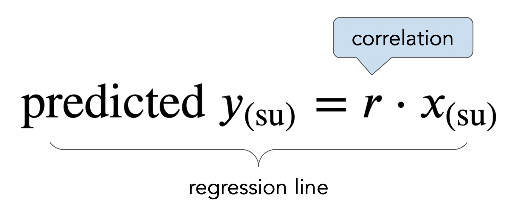
mom_son_su.plot(kind='scatter', x='mom (su)', y='son (su)', title=r'A good line goes through the origin and has slope $r$', figsize=(10, 5));
plt.plot(x, y, color='orange', label='regression line', lw=4)
plt.xlim(-3, 3)
plt.legend();

More on regression, including: