import pandas as pd
import numpy as np
import os
import seaborn as sns
import plotly.express as px
import plotly.figure_factory as ff
import plotly.graph_objects as go
pd.options.plotting.backend = 'plotly'
# Used for plotting examples.
def create_kde_plotly(df, group_col, group1, group2, vals_col, title=''):
fig = ff.create_distplot(
hist_data=[df.loc[df[group_col] == group1, vals_col], df.loc[df[group_col] == group2, vals_col]],
group_labels=[group1, group2],
show_rug=False, show_hist=False,
colors=['#ef553b', '#636efb'],
)
return fig.update_layout(title=title)
conda activate dsc80
before working on assignments!A good strategy is to assess missingness in the following order.
In each of the following examples, decide whether the missing data are likely to be MD, NMAR, MAR, or MCAR:
'gender'
and 'age'
. 'age'
has missing values.'self-reported education level'
, which contains missing values.'Version 1'
, 'Version 2'
, and 'Version 3'
. $\frac{2}{3}$ of the entries in the table are NaN
.We won't spend much time on these in lecture, but you may find them helpful.
Suppose we have:
Data is missing completely at random (MCAR) if
$$\text{P}(\text{data is present} \: | \: Y_{obs}, Y_{mis}, \psi) = \text{P}(\text{data is present} \: | \: \psi)$$That is, adding information about the dataset doesn't change the likelihood data is missing!
Suppose we have:
Data is missing at random (MCAR) if
$$\text{P}(\text{data is present} \: | \: Y_{obs}, Y_{mis}, \psi) = \text{P}(\text{data is present} \: | \: Y_{obs}, \psi)$$That is, MAR data is actually MCAR, conditional on $Y_{obs}$.
Suppose we have:
Data is not missing at random (NMAR) if
$$\text{P}(\text{data is present} \: | \: Y_{obs}, Y_{mis}, \psi)$$cannot be simplified. That is, in NMAR data, missingness is dependent on the missing value itself.
Phone | Screen Size | Price |
---|---|---|
iPhone 14 | 6.06 | 999 |
Galaxy Z Fold 4 | 7.6 | NaN |
OnePlus 9 Pro | 6.7 | 799 |
iPhone 13 Pro Max | 6.68 | NaN |
Suppose you have a DataFrame with columns named $\text{col}_1$, $\text{col}_2$, ..., $\text{col}_k$, and want to test whether values in $\text{col}_X$ are MCAR. To test whether $\text{col}_X$'s missingness is independent of all other columns in the DataFrame:
For $i = 1, 2, ..., k$, where $i \neq X$:
If all pairs of distribution were the same, then $\text{col}_X$ is MCAR.
heights = pd.read_csv('data/midparent.csv')
heights = heights.rename(columns={'childHeight': 'child'})
heights = heights[['father', 'mother', 'gender', 'child']]
heights.head()
father | mother | gender | child | |
---|---|---|---|---|
0 | 78.5 | 67.0 | male | 73.2 |
1 | 78.5 | 67.0 | female | 69.2 |
2 | 78.5 | 67.0 | female | 69.0 |
3 | 78.5 | 67.0 | female | 69.0 |
4 | 75.5 | 66.5 | male | 73.5 |
Proof that there aren't currently any missing values in heights
:
heights.isna().sum()
father 0 mother 0 gender 0 child 0 dtype: int64
We have three numerical columns – 'father'
, 'mother'
, and 'child'
. Let's visualize them simultaneously.
fig = px.scatter_matrix(heights.drop(columns=['gender']))
fig
'child'
MCAR by taking a random subset of heights
and setting the corresponding 'child'
heights to np.NaN
.'child'
height.np.random.seed(42) # So that we get the same results each time (for lecture).
heights_mcar = heights.copy()
idx = heights_mcar.sample(frac=0.3).index
heights_mcar.loc[idx, 'child'] = np.NaN
heights_mcar.head(10)
father | mother | gender | child | |
---|---|---|---|---|
0 | 78.5 | 67.0 | male | 73.2 |
1 | 78.5 | 67.0 | female | 69.2 |
2 | 78.5 | 67.0 | female | NaN |
3 | 78.5 | 67.0 | female | 69.0 |
4 | 75.5 | 66.5 | male | 73.5 |
5 | 75.5 | 66.5 | male | NaN |
6 | 75.5 | 66.5 | female | 65.5 |
7 | 75.5 | 66.5 | female | NaN |
8 | 75.0 | 64.0 | male | 71.0 |
9 | 75.0 | 64.0 | female | 68.0 |
heights_mcar.isna().mean()
father 0.000000 mother 0.000000 gender 0.000000 child 0.299786 dtype: float64
Aside: Why is the value for 'child'
in the above Series not exactly 0.3?
heights_mcar
¶heights_mcar
belongs to one of two groups:'child'
is missing.'child'
is not missing.heights_mcar['child_missing'] = heights_mcar['child'].isna()
heights_mcar.head()
father | mother | gender | child | child_missing | |
---|---|---|---|---|---|
0 | 78.5 | 67.0 | male | 73.2 | False |
1 | 78.5 | 67.0 | female | 69.2 | False |
2 | 78.5 | 67.0 | female | NaN | True |
3 | 78.5 | 67.0 | female | 69.0 | False |
4 | 75.5 | 66.5 | male | 73.5 | False |
'gender'
, 'mother'
, and 'father'
– separately for these two groups, and check to see if they are similar.'child'
distributions for 'gender'
¶gender_dist = (
heights_mcar
.assign(child_missing=heights_mcar['child'].isna())
.pivot_table(index='gender', columns='child_missing', aggfunc='size')
)
# Added just to make the resulting pivot table easier to read.
gender_dist.columns = ['child_missing = False', 'child_missing = True']
gender_dist = gender_dist / gender_dist.sum()
gender_dist
child_missing = False | child_missing = True | |
---|---|---|
gender | ||
female | 0.487768 | 0.478571 |
male | 0.512232 | 0.521429 |
'child'
's missingness does not depend on 'gender'
.'female'
doesn't make it any more or less likely that their height is missing than knowing if the child is 'male'
.'child'
distributions for 'gender'
¶'gender'
is similar whether or not 'child'
is missing.'gender'
when 'child'
is missing.'gender'
when 'child'
is not missing.gender_dist.plot(kind='barh', title='Gender by Missingness of Child Height', barmode='group')
To measure the "distance" between two categorical distributions, we use the total variation distance.
Note that with only two categories, the TVD is the same as the absolute difference in proportions for either category.
The code to run our simulation largely looks the same as in previous permutation tests.
n_repetitions = 500
shuffled = heights_mcar.copy()
tvds = []
for _ in range(n_repetitions):
# Shuffling genders.
# Note that we are assigning back to the same DataFrame for performance reasons;
# see https://dsc80.com/resources/lectures/lec11/lec11-fast-permutation-tests.html.
shuffled['gender'] = np.random.permutation(shuffled['gender'])
# Computing and storing the TVD.
pivoted = (
shuffled
.pivot_table(index='gender', columns='child_missing', aggfunc='size')
.apply(lambda x: x / x.sum())
)
tvd = pivoted.diff(axis=1).iloc[:, -1].abs().sum() / 2
tvds.append(tvd)
observed_tvd = gender_dist.diff(axis=1).iloc[:, -1].abs().sum() / 2
observed_tvd
0.009196155526430771
fig = px.histogram(pd.DataFrame(tvds), x=0, nbins=50, histnorm='probability',
title='Empirical Distribution of the TVD')
fig.add_vline(x=observed_tvd, line_color='red')
fig.add_annotation(text=f'<span style="color:red">Observed TVD = {round(observed_tvd, 2)}</span>',
x=2.3 * observed_tvd, showarrow=False, y=0.16)
fig.update_layout(yaxis_range=[0, 0.2])
np.mean(np.array(tvds) >= observed_tvd)
0.838
'gender'
when 'child'
is missing is the same as the distribution of 'gender'
when 'child'
is not missing.'child'
column is not dependent on 'gender'
.'child'
distributions for 'father'
¶'father'
when 'child'
is missing.'father'
when 'child'
is not missing.'child'
is not dependent on the height of the 'father'
.px.histogram(heights_mcar, x='father', color='child_missing', histnorm='probability', marginal='box',
title="Father's Height by Missingness of Child Height", barmode='overlay', opacity=0.7)
We can visualize numerical distributions with histograms, or with kernel density estimates. (See the definition of create_kde_plotly
at the top of the notebook if you're curious as to how these are created.)
create_kde_plotly(heights_mcar, 'child_missing', True, False, 'father',
"Father's Height by Missingness of Child Height")
'child'
is MCAR¶heights_mcar
other than 'child'
.'child'
is missing is the same as the distribution of the column when 'child'
is not missing, then we can conclude 'child'
is MCAR.Now, we will make 'child'
heights MAR by deleting 'child'
heights according to a random procedure that depends on other columns.
np.random.seed(42) # So that we get the same results each time (for lecture).
def make_missing(r):
rand = np.random.uniform() # Random real number between 0 and 1.
if r['father'] > 72 and rand < 0.5:
return np.NaN
elif r['gender'] == 'female' and rand < 0.3:
return np.NaN
else:
return r['child']
heights_mar = heights.copy()
heights_mar['child'] = heights_mar.apply(make_missing, axis=1)
heights_mar['child_missing'] = heights_mar['child'].isna()
heights_mar.head()
father | mother | gender | child | child_missing | |
---|---|---|---|---|---|
0 | 78.5 | 67.0 | male | NaN | True |
1 | 78.5 | 67.0 | female | 69.2 | False |
2 | 78.5 | 67.0 | female | 69.0 | False |
3 | 78.5 | 67.0 | female | 69.0 | False |
4 | 75.5 | 66.5 | male | NaN | True |
'child'
distributions for 'gender'
, again¶This time, the distribution of 'gender'
in the two groups is very different.
gender_dist = (
heights_mar
.assign(child_missing=heights_mar['child'].isna())
.pivot_table(index='gender', columns='child_missing', aggfunc='size')
)
# Added just to make the resulting pivot table easier to read.
gender_dist.columns = ['child_missing = False', 'child_missing = True']
gender_dist = gender_dist / gender_dist.sum()
gender_dist
child_missing = False | child_missing = True | |
---|---|---|
gender | ||
female | 0.397386 | 0.881657 |
male | 0.602614 | 0.118343 |
gender_dist.plot(kind='barh', title='Gender by Missingness of Child Height', barmode='group')
'child'
heights in the dataset with missing values, will it be less than or greater than the average 'child'
height in the full dataset?'child'
heights tend to be missing much more frequently when the child is 'female'
.'child'
height in the dataset with missing values will be greater than the average 'child'
height in the full dataset. # When child heights are MAR:
heights_mar['child'].mean()
67.10339869281046
# When child heights are not missing:
heights['child'].mean()
66.74593147751605
# When child heights are MCAR:
heights_mcar['child'].mean()
66.7256880733945
'child'
distributions for 'father'
, again¶create_kde_plotly(heights_mar, 'child_missing', True, False, 'father',
"Father's Height by Missingness of Child Height")
'father'
and 'gender'
.heights_mar.groupby('child_missing')['father'].mean().diff().iloc[-1]
1.0055466604787853
The difference in means works well in some cases. Let's look at one such case.
Below, we artificially generate two numerical datasets.
np.random.seed(42) # So that we get the same results each time (for lecture).
N = 1000 # Number of samples for each distribution.
# Distribution 'A'.
distr1 = pd.Series(np.random.normal(0, 1, size=N//2))
# Distribution 'B'.
distr2 = pd.Series(np.random.normal(3, 1, size=N//2))
data = pd.concat([distr1, distr2], axis=1, keys=['A', 'B']).unstack().reset_index().drop('level_1', axis=1)
data = data.rename(columns={'level_0': 'group', 0: 'data'})
meanA, meanB = data.groupby('group')['data'].mean().round(7).tolist()
create_kde_plotly(data, 'group', 'A', 'B', 'data', f'mean of A: {meanA}<br>mean of B: {meanB}')
Let's generate two distributions that look very different but have the same mean.
np.random.seed(42) # So that we get the same results each time (for lecture).
N = 1000 # Number of samples for each distribution.
# Distribution 'A'.
a = pd.Series(np.random.normal(0, 1, size=N//2))
b = pd.Series(np.random.normal(4, 1, size=N//2))
distr1 = pd.concat([a,b], ignore_index=True)
# Distribution 'B'.
distr2 = pd.Series(np.random.normal(distr1.mean(), distr1.std(), size=N))
data = pd.concat([distr1, distr2], axis=1, keys=['A', 'B']).unstack().reset_index().drop('level_1', axis=1)
data = data.rename(columns={'level_0': 'group', 0: 'data'})
meanA, meanB = data.groupby('group')['data'].mean().round(7).tolist()
create_kde_plotly(data, 'group', 'A', 'B', 'data', f'mean of A: {meanA}<br>mean of B: {meanB}')
In this case, if we use the difference in means as our test statistic in a permutation test, we will fail to reject the null that the two distributions are different.
n_repetitions = 500
shuffled = data.copy()
diff_means = []
for _ in range(n_repetitions):
# Shuffling the values, while keeping the group labels in place.
shuffled['data'] = np.random.permutation(shuffled['data'])
# Computing and storing the absolute difference in means.
diff_mean = shuffled.groupby('group')['data'].mean().diff().abs().iloc[-1]
diff_means.append(diff_mean)
diff_means[:10]
[0.06814385394584077, 0.010122359182524576, 0.2002163697731203, 0.2428154903924331, 0.010075853494653675, 0.07500611481190367, 0.02273396310350906, 0.0016829212124784831, 0.015376481518938778, 0.08595787219948381]
observed_diff = data.groupby('group')['data'].mean().diff().abs().iloc[-1]
fig = px.histogram(pd.DataFrame(diff_means), x=0, nbins=50, histnorm='probability',
title='Empirical Distribution of the Absolute Difference in Means')
fig.add_vline(x=observed_diff, line_color='red')
fig.add_annotation(text=f'<span style="color:red">Observed Absolute Difference in Means = {round(observed_diff, 2)}</span>',
x=1.45 * observed_diff, showarrow=False, y=0.07)
# The computed p-value is fairly large.
np.mean(np.array(diff_means) >= observed_diff)
0.108
create_kde_plotly(data, 'group', 'A', 'B', 'data', f'mean of A: {meanA}<br>mean of B: {meanB}')
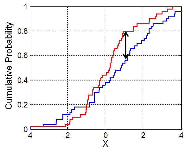
Let's look at the CDFs of our two synthetic distributions.
# Think about what this function is doing!
def create_cdf(group):
return data.loc[data['group'] == group, 'data'].value_counts(normalize=True).sort_index().cumsum()
fig = go.Figure()
fig.add_trace(
go.Scatter(x=create_cdf('A').index, y=create_cdf('A'), name='CDF of A')
)
fig.add_trace(
go.Scatter(x=create_cdf('B').index, y=create_cdf('B'), name='CDF of B')
)
fig.update_layout(title='CDFs of A and B')
Fortunately, we don't need to calculate the K-S statistic ourselves! Python can do it for us (and you can use this pre-built version in all assignments).
from scipy.stats import ks_2samp
ks_2samp?
observed_ks = ks_2samp(data.loc[data['group'] == 'A', 'data'], data.loc[data['group'] == 'B', 'data']).statistic
observed_ks
0.14
We don't know if this number is big or small. We need to run a permutation test!
n_repetitions = 500
shuffled = data.copy()
ks_stats = []
for _ in range(n_repetitions):
# Shuffling the data.
shuffled['data'] = np.random.permutation(shuffled['data'])
# Computing and storing the K-S statistic.
groups = shuffled.groupby('group')['data']
ks_stat = ks_2samp(groups.get_group('A'), groups.get_group('B')).statistic
ks_stats.append(ks_stat)
ks_stats[:10]
[0.037, 0.048, 0.04, 0.068, 0.045, 0.04, 0.042, 0.052, 0.019, 0.029]
fig = px.histogram(pd.DataFrame(ks_stats), x=0, nbins=50, histnorm='probability',
title='Empirical Distribution of the K-S Statistic')
fig.add_vline(x=observed_ks, line_color='red')
fig.add_annotation(text=f'<span style="color:red">Observed KS = {round(observed_ks, 2)}</span>',
x=0.85 * observed_ks, showarrow=False, y=0.16)
fig.update_layout(xaxis_range=[0, 0.2])
fig.update_layout(yaxis_range=[0, 0.2])
np.mean(np.array(ks_stats) >= observed_ks)
0.0
We were able to differentiate between the two distributions using the K-S test statistic!
ks_2samp
¶scipy.stats.ks_2samp
actually returns both the statistic and a p-value.ks_2samp(data.loc[data['group'] == 'A', 'data'], data.loc[data['group'] == 'B', 'data'])
KstestResult(statistic=0.14, pvalue=5.822752148022591e-09)